· 20 min read · Jonathan Chrisnaldy
The Payback Period Assumes You Are Paying It Back
Divide a degree's median debt by its graduates' median earnings and you get the price of that degree in years of salary. Across 31,941 US programmes the median is 0.59, about seven months. That sum is correct. It is also a price, not a deadline, and it quietly assumes a ten-year repayment schedule that about one federal loan dollar in five is actually on.
Let us do the sum properly, because it is a good sum and it deserves better than the way it usually gets waved around.
For about one degree programme in seven, the U.S. Department of Education publishes the median debt its graduates left with and the median amount they earned a year later (U.S. Department of Education, 2026). Divide one by the other and you get the price of that degree in years of gross salary. Across the 31,941 programmes that report both figures, the median is 0.59. About seven months.
That is the whole argument for taking the loan, and on its own terms it is a good argument. Seven months of gross earnings, spread over a decade, for a qualification you keep for life. I went looking for the field where this breaks down and I could not really find one. The most expensive field in America by this measure, out of the 153 with at least 25 programmes, is Dance, at 1.11 years. Drama and theatre arts is 1.09. Film, video and photographic arts is 1.04. The worst-priced fields in the country still cost about a year of what they earn.
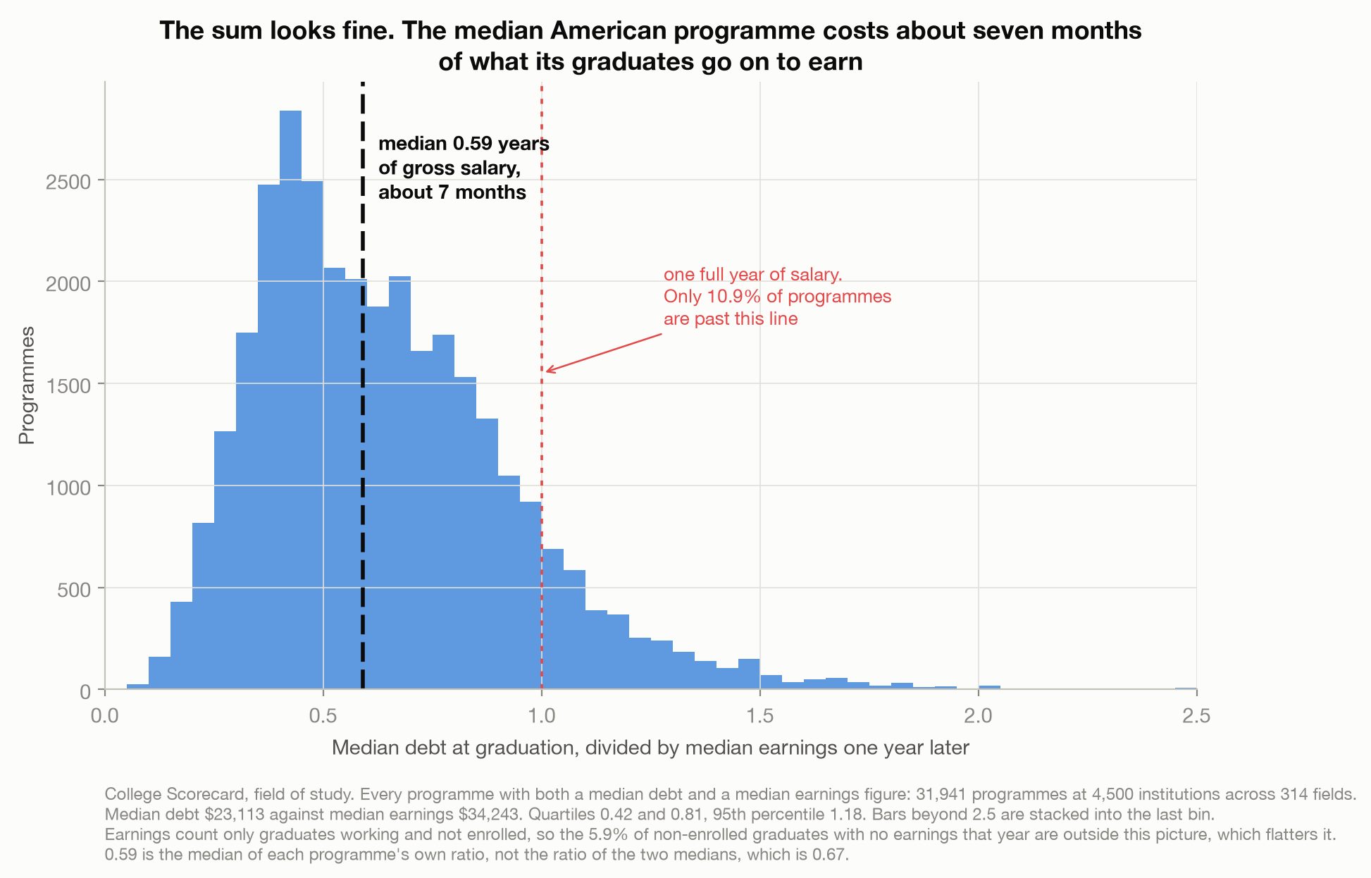
Only 10.9% of programmes cost more than a single year of earnings. Individual programmes do go further than the field medians suggest, and about one in a hundred costs more than a year and a half, but whatever else is wrong with American higher education, the price of the median programme is not obviously insane.
One thing about that sum before we go on, because I did not notice it until late and it is the sharpest example of the whole argument. The debt figure and the earnings figure are not the same graduates. The Department’s own cohort map assigns the debt to students who finished in 2018-19 and 2019-20, and the earnings to students who finished in 2016-17 and 2017-18, measured in 2018 and 2019. The two numbers sit in adjacent columns of one file, they are obviously meant to be read together, and they describe different people who left school in different years.
That does not make the division useless. It is the pairing the Department publishes, and it is the one anybody doing this arithmetic will land on. But it is the first of several things inside this number that nobody repeats when they quote it.
So the sum is fine, with an asterisk. The problem is what people think it answers.
The sum answers a price question
Debt divided by earnings tells you what the degree cost, denominated in your own future salary. It is a price. Read it out loud and it sounds like a deadline: seven months, and then this is over.
It is not, and the reason is hiding in a sentence in the Department’s own documentation. Explaining how it computes the monthly payment behind these figures, it says the estimates “are based on a standard 10-year fixed payment plan” (U.S. Department of Education, 2024, p. 11). The same paragraph tells you what to do about it, and almost nobody does: it warns that this is “only one of many payment plans available to borrowers”.
There is nothing wrong with the assumption. You have to assume some schedule to turn a balance into a monthly number, and for the undergraduate loans behind these figures the ten-year standard plan was the one a borrower fell into if they never chose another (Choice of repayment plan, 2026). But it is an assumption, and the same department publishes, every quarter, exactly how many people are actually on it.
About one dollar in five
The Federal Student Aid data centre reports the Direct Loan portfolio by repayment plan (Federal Student Aid, 2026). I found the files through Data Is Plural (Singer-Vine, 2020), and they are free, quarterly, and go back to 2013.
At the most recent quarter, of the $1,241B of Direct Loans in repayment, deferment or forbearance, 21.9% is on a standard plan of ten years or less. In 2013 that share was 38.7%. Income-driven plans went the other way over the same period, from 20.0% to 61.5%.
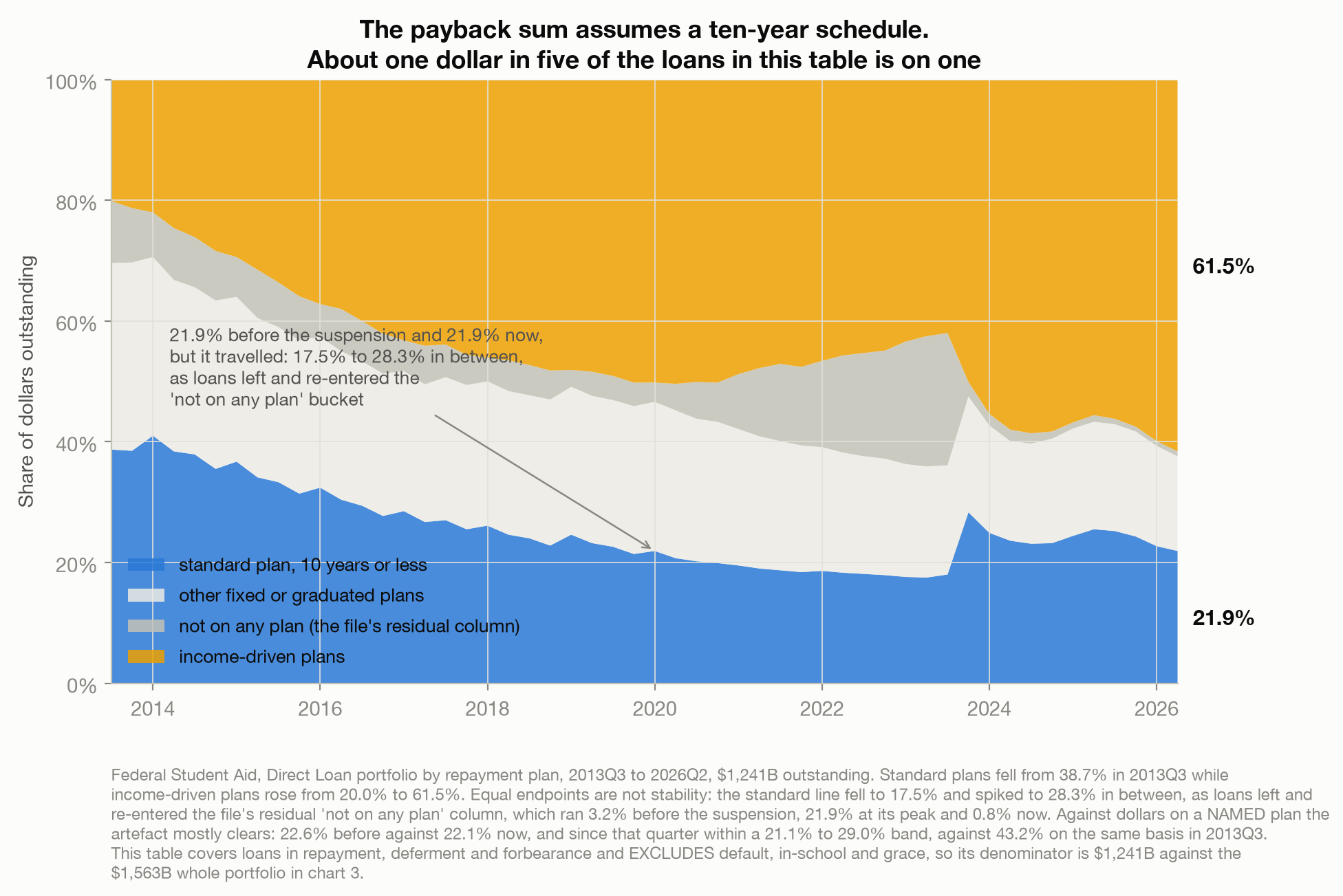
This is the load-bearing fact of the piece, so let me show you the part that nearly fooled me. The standard share was 21.9% in the last quarter lying wholly before the suspension, the one ending 31 December 2019, and it is 21.9% today. I wrote that down as proof the pandemic had left this series alone. It is not proof of anything. Equal endpoints say nothing about the path, and the path moved: the same line fell to 17.5% in early 2023 and spiked to 28.3% that September.
The reason is the file’s own residual column, which it defines as loans “not currently listed on a repayment plan”. That bucket held 3.2% of these dollars before the suspension, swelled to 21.9% while payments were paused, and is 0.8% today. While it was swollen it deflated the reported share of every named plan. When repayment resumed and those loans were assigned, the reassignment was not proportional: it went overwhelmingly to the standard ten-year plan and to SAVE, which is why the standard line spiked. Three of the nine named plans fell in that quarter rather than rising.
Measure instead against the dollars actually on a named plan, and the artefact mostly comes out: 22.6% before the suspension against 22.1% now. That series is steadier but it is not flat either. Since that pre-suspension quarter it has run between 21.1% and 29.0%, the top of that range being the quarter repayment restarted; over the longer run it was far higher, 43.2% on the same basis in 2013. Both denominators give about one dollar in five, which is the claim I am making. What neither of them supports is the tidier sentence I wrote first.
The long decline from 38.7% is the solid part. It happened over the six and a half years before the pandemic and owes it nothing.
Income-driven plans are worth describing rather than gesturing at, because they are the mechanism. They cap the monthly payment at a percentage of discretionary income instead of sizing it to retire the balance. The file’s own definition of the income-based plan is that it caps payments “at 10 or 15 percent of their discretionary income” and that “any remaining loan balance is forgiven after 20 or 25 years of qualifying payments” (Federal Student Aid, 2026). That is a real trade, and it cuts both ways: a payment you can afford this month, against a balance you carry for two decades, or one that ends by being written off rather than by being paid. I am not going to tell you which side of that is better.
Those particular terms belong to the income-based plan, and the file defines its siblings differently. SAVE, which is about half of the income-driven total, it describes only as basing payments on a percentage of income, with no forgiveness clause stated at all. What the four have in common is narrower than a shared rulebook: none of them is a ten-year schedule, and three fifths of the money in this table now sits on one of them.
And the schedule can be switched off
Here is the strange part of the data, and the second reason to distrust the deadline reading.
Between 2020 and 2023, the share of Direct Loan dollars in active repayment fell to 0.7%. Not a typo and not a collapse in willingness to pay: the CARES Act suspended payments on federally held student loans, successive extensions carried it to the autumn of 2023, and across the thirteen quarter-end snapshots lying wholly inside the pause, 30 June 2020 to 30 June 2023, forbearance averaged 72.2% of the portfolio, its lowest quarter being 67.5% (Coronavirus Aid, Relief, and Economic Security Act, 2020, sec. 3513; the Act’s own suspension ran only to 30 September 2020 and every extension after that came by executive action). The window matters and I am naming it rather than saying “the three years of the pause”: add the quarter the suspension began in, when it was eighteen days old and forbearance still stood at 12.7%, barely above its 9.9% pre-pandemic level, and the same average drops to 67.9%.
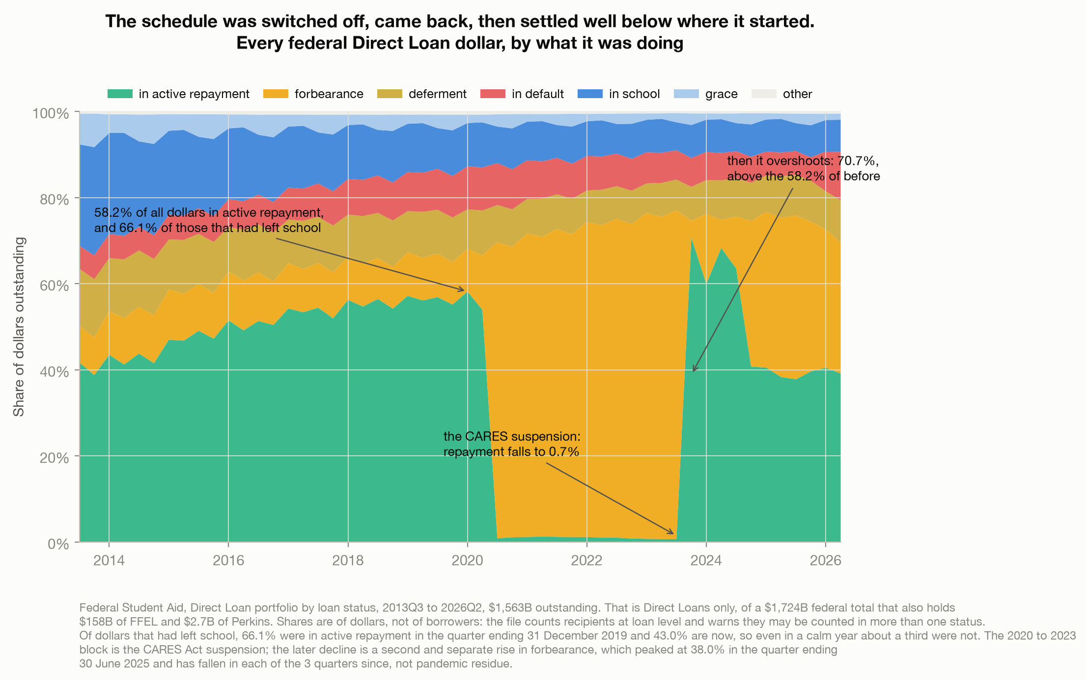
Then it came back, and this is the part I got wrong on my first pass through the file. Repayment did not limp back. It overshot, reaching 70.7% of dollars in the quarter ending 30 September 2023, well above the 58.2% of the last quarter before any of it. And then it fell again, to 39.2% today, because forbearance rose a second time, long after the pandemic measures had lapsed. I want to state that second move as carefully as I just insisted on the first, because it is not a smooth climb and it is not still climbing. Forbearance went 3.9% in that September quarter, then 16.3%, 6.5%, 12.1% and 33.8% through 2024, peaked at 38.0% in the quarter ending 30 June 2025, and has fallen in each of the three quarters since, to 30.4% now.
So the honest version is that the share of loans in active repayment has swung between 0.7% and 70.7% inside six years, and has sat between 37.8% and 40.7% for the seven quarters since it stepped down. The first move has a name in statute. The second, that forbearance episode, I cannot attribute from these two files, and I am not going to guess at it in a post about not guessing. What the files do show is a line that moves in ten-point steps for reasons no individual borrower controls, which is not a timetable you can divide a balance by.
And you do not need any of it to make the point. Take the quarter ending 31 December 2019, before all of this. Of the dollars that had already left school, 33.9% were not in active repayment. Roughly a third, in a calm year, sitting in deferment, forbearance or default.
One more thing about the price
While I was checking the first chart I noticed something I had assumed away, and then I got the explanation wrong too, so both belong here.
I had expected debt and earnings to move together, on the theory that expensive degrees lead to well-paid work. They barely do: the correlation is 0.25. What the picture actually shows is horizontal stripes.
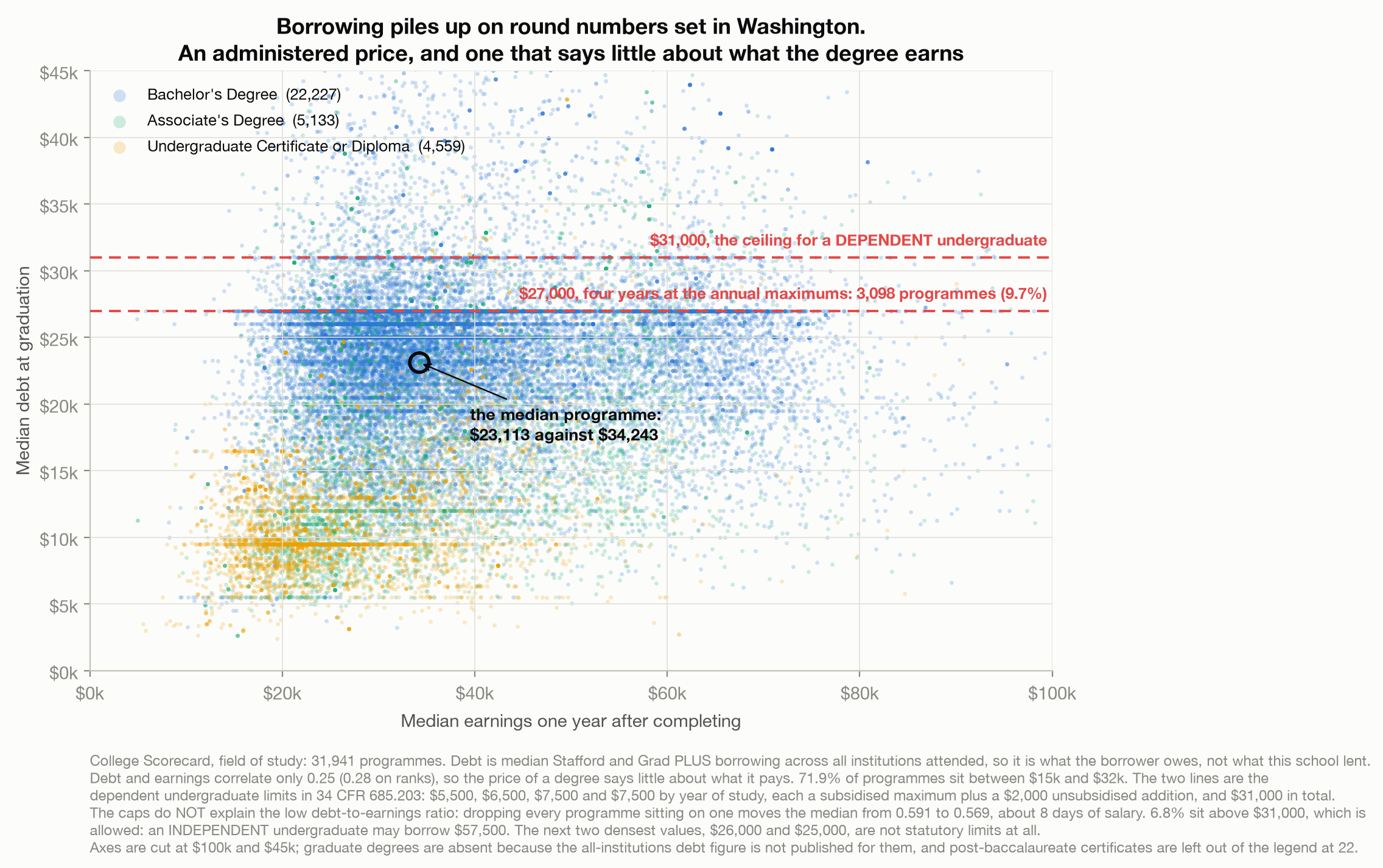
The single most common median debt in America is exactly $27,000, reported by 3,098 programmes, about one in ten. That is not a market price. A dependent undergraduate may borrow $5,500, $6,500, $7,500 and $7,500 across four years of study. Those totals are not printed in the regulation; each is a subsidised annual maximum from one paragraph plus the $2,000 unsubsidised addition from another, and the four add to $27,000 (Loan limits, 2026).
I wanted that to explain the comfortable seven months, and it does not. Strip out every programme reporting exactly one of the two federal limits and the median ratio moves from 0.591 to 0.569, about eight days of salary. Nearly 15% of programmes are above the four-year figure anyway, and the median programme’s debt is only 86% of it.
What the bands do show is that a lot of borrowing lands on round numbers, and the biggest of those numbers is a statutory maximum. Not all of them are: the second and third densest values, $26,000 and $25,000, are not limits at all. So the picture is of borrowing shaped partly by a rulebook and partly by whatever else moves a school’s costs. That is worth knowing. It is not the reason the sum looks reassuring.
What I actually think you should take from this
Not that the loan is a bad deal. The sum is real, and for most programmes it says something genuinely reassuring about the price.
The mistake is finer than that, and this piece is a record of me making adjacent versions of it: I read equal endpoints as a stable series, and I read a cluster of debt at a statutory cap as an explanation for a low ratio. Debt divided by earnings is a price. It tells you what the thing cost, in a currency that means something to you, namely your own time at work. It does not tell you when you stop paying, because that depends on a repayment schedule that most of the money is not on, that was switched off for three and a half years and came back to a level well below where it started, and that you will land on later under circumstances you cannot see from here.
A price is not a deadline. They are different questions and only the first one is a division problem.
That generalises past student loans, which is why I bothered writing it down. Any loan underwritten against income you do not have yet comes with a number that looks like an end date and is really a price tag: a mortgage affordability multiple, a business loan against projected revenue, a car financed on a salary you are fairly confident about. In each case somebody has divided a balance by an income and quietly assumed a schedule. The schedule is the part worth reading.
Method notes
Every share of the loan portfolio is a share of dollars, never of borrowers. The Federal Student Aid files warn that “recipient counts are based at the loan level” and that recipients “may be counted multiple times across varying loan statuses”, so the recipient columns cannot be summed across categories. Shares of programmes, of graduates and of file rows appear too, and are labelled as such where they occur.
Everything here is the Direct Loan portfolio, which is not the whole of federal student debt. Direct Loans are $1,562.9B of a $1,723.9B federal total at the latest quarter, the balance being $158.3B of Federal Family Education Loans and $2.7B of Perkins loans. Both FSA tables used here cover Direct Loans only.
The two loan tables have different denominators, and I have not mixed them. Portfolio by loan status covers the whole Direct Loan book, $1,563B. Portfolio by repayment plan covers only loans in repayment, deferment and forbearance, excluding default, in-school and grace, which is $1,241B. The $322B gap is those three categories, $314B, plus the $8B the status table books as “other”.
Federal fiscal quarters are not calendar quarters, and I got this wrong first time. The fiscal year begins 1 October, so Q4 ends 30 September. Fiscal 2019 Q4 is a September 2019 snapshot, five months before the suspension began on 13 March 2020, not the quarter preceding it. Every “before the pandemic” figure here is fiscal 2020 Q1, ending 31 December 2019.
Which figures survive the pandemic. The repayment-plan mix does: 21.9% on a standard plan in the quarter ending 31 December 2019 against 21.9% now. The repayment-status shares do not, so the structural claim quotes the pre-suspension quarter and the post-2020 movement is described as two separate episodes rather than a trend.
The debt figure is disbursed federal borrowing, not everything owed. Scorecard publishes two medians, “disbursed at all institutions” and “disbursed at this institution”, and I use the first because it follows the student rather than the school. Both count Stafford and Grad PLUS loans only, and count what was disbursed, so Parent PLUS borrowing, private loans and all accrued interest are outside it.
Almost entirely undergraduate. The all-institutions debt figure is published for no graduate credential at all: not master’s, doctoral or first-professional degrees, and not graduate or professional certificates either. What is left is bachelor’s degrees, associate degrees and undergraduate certificates, plus the one credential that sits above a bachelor’s and still carries the figure, the post-baccalaureate certificate, which contributes 22 programmes here. The this-institution measure does cover graduate degrees and gives 0.577 overall, which looks like agreement but is not. It is computed on a different set of rows, and on undergraduate rows alone it gives 0.541. Read it as a different measure landing nearby, not as confirmation.
The earnings figure only counts people with jobs. Its definition is the median earnings of graduates “working and not enrolled” a year after finishing. Among graduates not enrolled in the programmes analysed here, 5.9% had no earnings that year and are outside the denominator entirely. That makes the price look better than it is, and it is the single largest reason to treat 0.59 as optimistic.
There is no like-for-like check on measuring earnings later. The two-year earnings column looks like one, and gives 0.585 against 0.591, but it belongs to a different cohort again, so it compares nothing. See the cohort note below.
The numerator and denominator are different cohorts. From the Department’s own cohort map for this file: median debt is the NSLDS pooled AY2018-19 and AY2019-20 cohort; median earnings one year out is the Treasury pooled AY2016-17 and AY2017-18 cohort, measured in calendar 2018 and 2019 and adjusted to 2020 dollars. The two-year earnings column is a third cohort again, AY2014-15 and AY2015-16, which is why it cannot serve as a check on measuring the same graduates later. Every ratio in this post therefore divides one set of leavers’ borrowing by an earlier set’s pay. That is how the file is built and how it is universally used, and it is stated here rather than buried.
The median is a median of ratios. 0.59 is the median of each programme’s own debt-to-earnings ratio. It is not the ratio of the two medians, $23,113 over $34,243, which is 0.67. Those are different statistics and only the first one describes a typical programme.
Sample. 31,941 programmes at 4,500 institutions across 314 fields of study, being every programme that reports both a median debt and a median earnings figure. That is 14% of all rows in the field-of-study file; the rest are unreported, generally for small cohorts. This is not a census of American degrees. Field names are the Department’s own, lightly reworded in the text: “Drama and theatre arts” is “Drama/Theatre Arts and Stagecraft”, which also covers stagecraft, and “Film, video and photographic arts” is “Film/Video and Photographic Arts”.
What this cannot tell you. Whether the degree caused the earnings. Scorecard observes people who completed a programme and later had a job. It has no comparison group, and nothing here should be read as a return on investment.
References
Choice of repayment plan, 34 C.F.R. § 685.210 (2026). https://www.ecfr.gov/current/title-34/section-685.210
Coronavirus Aid, Relief, and Economic Security Act, Pub. L. No. 116-136, § 3513, 134 Stat. 281 (2020). https://www.govinfo.gov/content/pkg/PLAW-116publ136/html/PLAW-116publ136.htm
Federal Student Aid. (2026). Federal student loan portfolio [Data set]. U.S. Department of Education. Retrieved July 31, 2026, from https://studentaid.gov/data-center/student/portfolio
Loan limits, 34 C.F.R. § 685.203 (2026). https://www.ecfr.gov/current/title-34/section-685.203
Singer-Vine, J. (2020, December 2). Data Is Plural: 2020.12.02 edition. https://www.data-is-plural.com/archive/2020-12-02-edition/
U.S. Department of Education. (2024, June). Technical documentation: College Scorecard data by field of study. Retrieved July 31, 2026, from https://collegescorecard.ed.gov/assets/FieldOfStudyDataDocumentation.pdf
U.S. Department of Education. (2026, June 10). College Scorecard: Most recent data by field of study [Data set]. Retrieved July 31, 2026, from https://collegescorecard.ed.gov/data/
// About the author
Jonathan Chrisnaldy is a product manager and analyst in New York City, with an M.S. in Technology Management from Columbia University. He writes data stories about the numbers behind everyday claims. More on the experience page or LinkedIn.