· 21 min read · Jonathan Chrisnaldy
The Map Used to Run the Other Way
A chart of temperature against national income is one of the tidiest things in economics, and it is real. It is also impossible to read the way it invites you to, because among former colonies the same thermometer used to point the other way.
Someone showed me a chart of average temperature against national income, and it is one of the tidiest things you will ever see in economics. Hot countries are poor. Cold countries are rich. One variable, one line, the wealth of nations explained by a thermometer.
That is what bothered me. An answer that tidy about something that complicated is usually an answer to a different question.
So I went and got the data. The chart is real. It is also, I think, impossible to read the way it invites you to.
The tidy story, and it is true
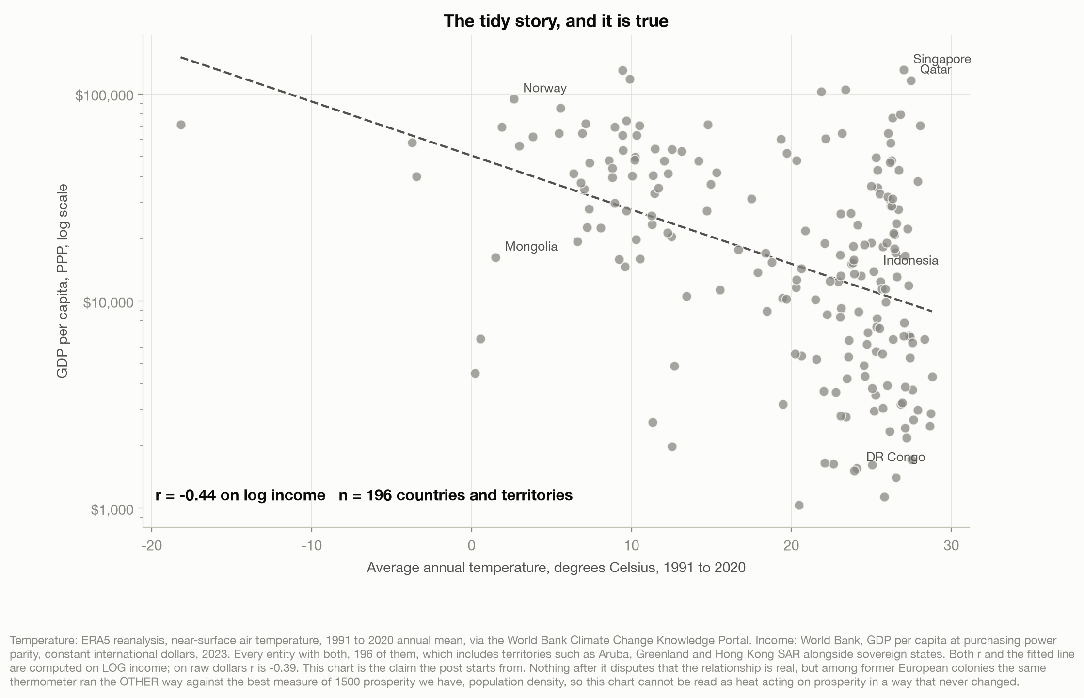
Average annual temperature against GDP per capita, every place with both, 196 countries and territories. On log income the correlation is minus 0.44. Nothing in this post disputes that the correlation is real. What follows disputes what the correlation means.
Two things worth saying before the chart gets away from us. First, minus 0.44 accounts for about a fifth of the variation in log income, which leaves four fifths somewhere else. Between 24 and 28 degrees the countries in this chart run from about 1,100 dollars a head to about 130,000. Second, temperature is not even the strongest crude variable available. On one common sample of 159 countries, temperature manages minus 0.46, absolute latitude does better at plus 0.60, and a plain Africa dummy does better still at minus 0.68. I left those out of an earlier draft, which was the wrong instinct: a continent label beats the thermometer, and neither is an explanation.
The other thing to notice is who is in the corner. Norway, Canada and Switzerland sit up in the cold and rich part, as advertised. But there are seventeen places above twenty degrees with incomes over forty thousand dollars, ten of them sovereign states and the rest territories, not the two or three the chart’s shape suggests. They do not break the relationship. They are a reminder that it is a tendency and not a law.
If you stop here, the conclusion writes itself. Heat is bad for prosperity, the tropics drew a bad hand, and there is not much to be done about latitude.
The same thermometer, five centuries earlier
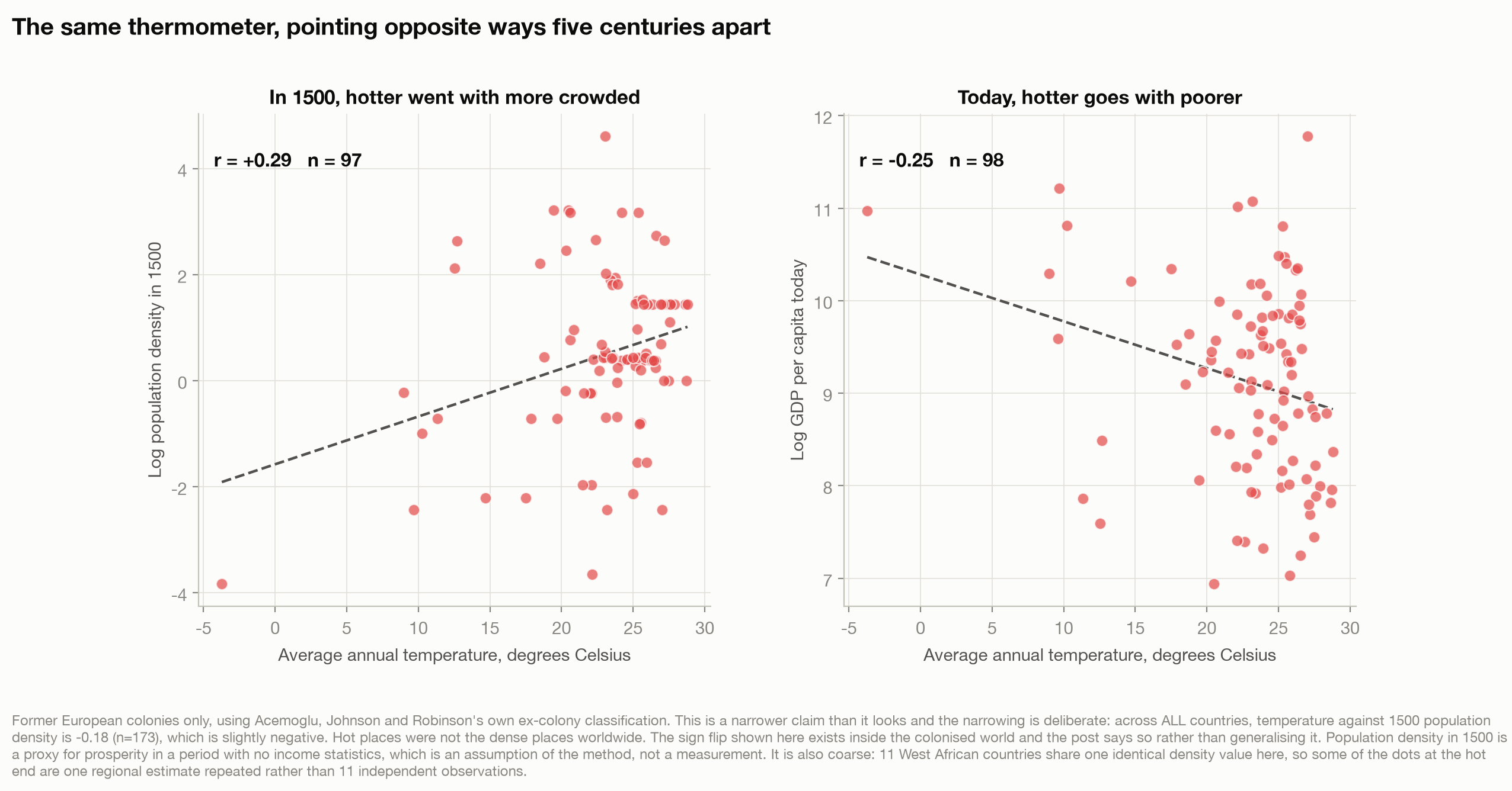
Here is the problem. We can look at roughly the same places in 1500.
Nobody measured GDP in 1500, so economic historians use what they can reconstruct: how many people a place supported per unit of arable land, from Colin McEvedy and Richard Jones’s population atlas (1978). The reasoning is that in a preindustrial economy only a relatively productive place could feed a dense population. Acemoglu, Johnson and Robinson, whose measure this is, concede the theoretical link is “more complex” than that and rely on it anyway (Acemoglu et al., 2002), and their other measure runs through urbanisation, where the claim is that only places with high agricultural productivity and a developed transport network can support large towns.
Among the places Europeans would later colonise, temperature and population density in 1500 correlate at plus 0.29 across 97 countries. The same thermometer correlates with income today at minus 0.25 across 98, on a list that overlaps the first by 94.
The sign flipped.
One caveat, and it is mine rather than the literature’s, because I pre-registered this chart as a global claim and the global version is false. Across all countries, temperature against 1500 density is minus 0.18. The flip lives inside the colonised world, and I am not going to inflate it into something bigger than that.
The flip
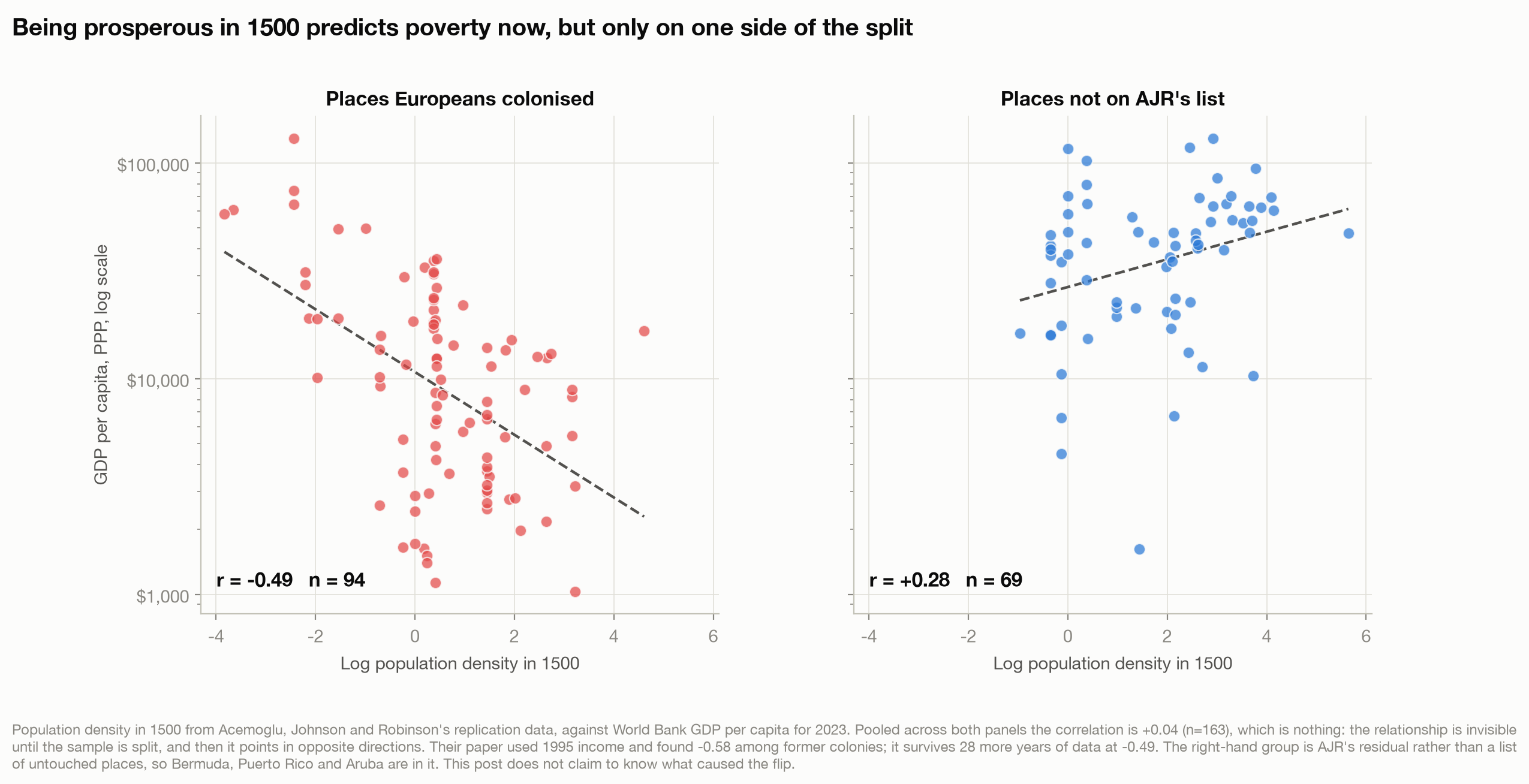
Now the version that does not depend on temperature at all. Take population density in 1500 and put it against income today.
Across all 163 countries with both, the correlation is plus 0.04. Nothing. A flat cloud. If you ran that regression you would conclude that where a place stood five centuries ago tells you nothing about where it stands now.
Split the sample by whether Europeans colonised the place and the nothing becomes two relationships pointing in opposite directions. Among 94 former colonies, being densely settled in 1500 correlates with income today at minus 0.49, which is firmly established. Among the 69 not on that list it runs the other way at plus 0.28, which is weaker and only just clear of chance. That group is AJR’s residual rather than a list of untouched places; Bermuda and Puerto Rico are in it. What is not in doubt is that the two differ. Fit them together with an interaction term and the slopes come out at plus 0.15 for the never-colonised and minus 0.33 for the colonised, a gap with a t statistic of minus 5.3 across 163 countries. This is the test the argument actually rests on.
This is Acemoglu, Johnson and Robinson’s finding (Acemoglu et al., 2002). I did not take it on trust: I downloaded their replication files and ran it against 2023 income to see whether it survived 28 more years. On their own 1995 income figures, recomputed from their file, the former-colony correlation is minus 0.58 across 91 countries; on 2023 income it is minus 0.49 across 94. It has weakened and it is still there. Worth being precise about what is theirs and what is mine: AJR do not publish a correlation. They publish a regression coefficient of minus 0.38 with an R-squared of 0.34 on those same 91 countries, which is the same relationship stated a different way.
The urbanisation measure points the same way on a much smaller sample, 43 countries on each side: minus 0.42 among former colonies against plus 0.28 among the rest. The second of those is not significant on its own. The gap between them is, with a t of minus 3.6.
What this rules out
I am not going to tell you what caused the reversal.
But a reversal is a demanding thing for an explanation to survive, and it disqualifies a specific class of them.
No explanation of the ranking between countries can have an effect that was both constant over the period and the same whether or not Europeans arrived. The test is on the effect, not the cause: the equator has not moved, but what it does to prosperity may have. If something pressed equally on prosperity in 1500 and today, and pressed equally on places Europeans reached and places they did not, it cannot produce a ranking that inverted in one group and did not in the other. Heat acting directly and identically on human productivity is the clearest casualty: it should have made the tropics poor in 1500 too, and among the colonised world it did the opposite. Outside that world heat did not reverse: across the 69 places measurable in both eras it runs minus 0.15 then and minus 0.04 now, neither clear of chance.
I want to be careful here, because an earlier draft said something stronger and false: that a climate story cannot see the colonial split. Climate sees it extremely well. In this data, absolute latitude correlates with whether a place was colonised at minus 0.74, which is tighter than any relationship elsewhere in this post. Europeans went to particular latitudes, and the tropics are where they went. A geographic story is not disqualified for being unable to see the colonial split. It is disqualified only if its effect also held steady across the five centuries.
What survives is anything whose effect changed over those five centuries, and anything constant that acted differently depending on whether Europeans arrived. That second category is not a technicality; it contains the most famous explanation in this literature, in which a fixed tropical disease environment mattered enormously because of how it shaped European settlement. A cause can be older than the reversal and still produce it.
That is a set, not an answer, and I am leaving it as a set. Less satisfying, and the honest shape of what the data supports: the difference between “the tropics are hot” and “the tropics are hot and something happened to them” is most of the argument.
The country I went looking for
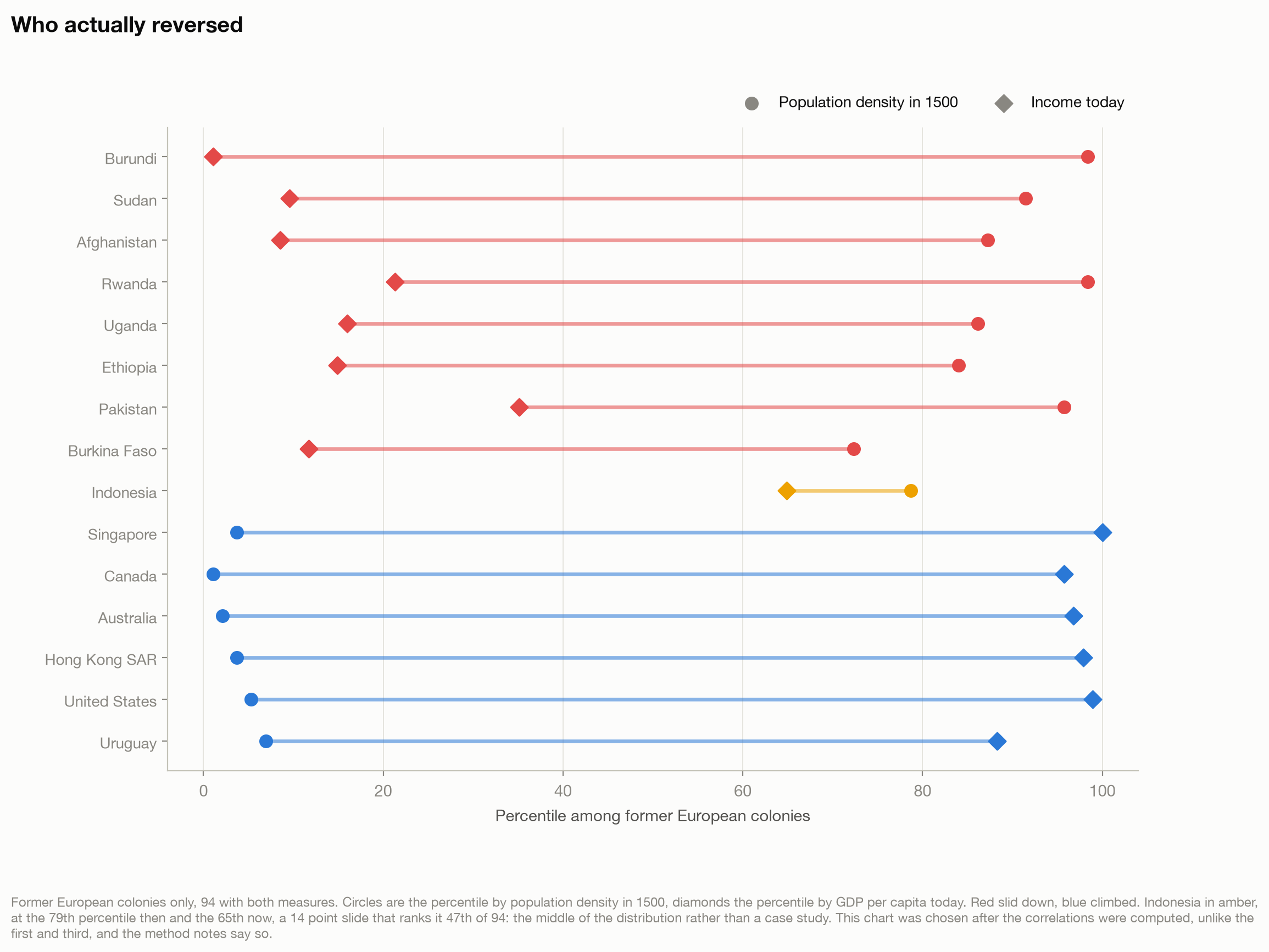
I will admit what I was hoping for. I am Indonesian, the archipelago was more densely settled in 1500 than most of the world Europeans went on to colonise, and I wanted my own country to be the illustration.
It is not. Indonesia sits at the 79th percentile of former colonies by population density in 1500 and the 65th by income today. A fourteen point slide, ranking 47th of 94. The middle of the distribution.
The real reversals are brutal. Burundi ran from the 98th percentile to the 1st. Sudan, 91st to 10th. Afghanistan, 87th to 9th. In the other direction, Singapore went from the 4th percentile to the 100th, Australia from the 2nd to the 97th, the United States from the 5th to the 99th.
I could have written the Indonesian section anyway. Picking the country you want and describing its slide is easy, and nobody checks the rank. But the whole point of this post is that a chart which looks like an explanation usually is not, and I would rather report that my own case is boring than demonstrate the exact error I am complaining about.
What this does and does not show
It does not show that temperature is irrelevant to income. Dell et al. (2012) use year to year weather variation within countries rather than differences between them, and find that in poor countries a one degree warmer year cut growth that year by about 1.3 percentage points, with no effect in rich countries they could tell apart from zero. That is a within-country question rather than a question about the ranking between them, so the filter above does not touch it, and it is evidence of a real effect of heat on output.
It does not show that institutions caused the reversal, or extraction, or disease. I have deliberately not gone there.
Two problems with the comparison itself, on the record rather than buried. The first is that splitting on colonisation is not innocent: Europeans chose where to go partly on the basis of what was already there, and partly on things like latitude that shape income today, so the thing I am conditioning on sits downstream of one side of the comparison and upstream of the other. That minus 0.74 is the measurement of it. That does not invalidate the description, but it does mean nobody should read “the split determines the sign” as a causal statement, and I am not making one.
The second is that population density in 1500 and income per head today are not the same quantity. In a preindustrial economy, better land tends to produce more people rather than richer ones, so density measures production per unit of arable land where modern GDP per capita measures production per person. AJR raise that caution themselves. Density is the wider-coverage second of AJR’s two proxies rather than their first, and it carries more weight here than any single variable should. The urbanisation measure is the check on that objection, which is why it is in the post at all: it is closer to a per-person measure, and it gives the same sign pattern.
And the reversal is a fact about former colonies. It is not a fact about the tropics in general, and I nearly wrote it as one.
What it does show is this. The chart that started me off is true and cannot mean what it looks like, because among former colonies that same thermometer used to point the other way: hotter went with more crowded. Whatever explains today’s map has to explain that inversion too, and an explanation whose effect never changed and never depended on whether Europeans arrived cannot.
The thermometer cannot be the whole of it, and cannot have inverted the ranking unless its effect changed. It is just the easiest thing to measure, and we have a habit of mistaking those for each other.
Method notes
What is being counted. Income is GDP per capita at purchasing power parity in constant 2021 international dollars, World Bank indicator NY.GDP.PCAP.PP.KD for 2023 (World Bank, 2026a). Temperature is near-surface air temperature from the ERA5 reanalysis, annual mean over 1991 to 2020, by country, from the World Bank Climate Change Knowledge Portal (World Bank, 2026b). Population density and urbanisation in 1500, the ex-colony classification and the 1995 income figures all come from Acemoglu, Johnson and Robinson’s own replication files, downloaded from the first author’s data archive and read directly rather than quoted from the paper.
Two transforms, both load-bearing. Income is logged in every correlation. So is population density in 1500: AJR’s variable is already in logs, its own label reads “log population density, 1500”, and the charts say so on their axes while an earlier version of these notes did not. Logging density is AJR’s own specification; logging the 2023 income series is my extension of it. Both matter enormously, and the second fact-check round found the first disclosure of this understated the cost. On untransformed density the former-colony correlation falls from minus 0.49 to minus 0.10 while the never-colonised one falls to plus 0.17, so the two signs still point opposite ways. But the interaction that the argument actually rests on falls from a t of minus 5.3 to minus 1.4, which is not distinguishable from zero. The sign pattern survives the transform. The test does not. Density in 1500 spans four orders of magnitude, so logging it is the right choice, but everything above is a result about log density, and a reader following an unlogged recipe would reproduce the shape and not the significance.
One assumption that is not a measurement. The 1500 correlations use today’s temperatures, because there is no 1991 to 2020 equivalent for 1500. That assumes the ranking of countries by warmth is roughly stable over five centuries. “The equator has not moved” defends latitude; it does not defend the temperature series, and I am relying on the assumption rather than testing it.
Two bugs found in fact-checking, both fixed before publication. The first: my de-duplication of the replication file kept the first row per country, and for Germany and Zimbabwe that row carries latitude but neither density nor income, so both were silently deleted from every correlation needing either. Urbanisation barely moved. Fixing it moved six published figures at the second decimal and changed most sample sizes in the post by one or two, and, more usefully, brought the 1995 former-colony correlation to minus 0.58 on 91 countries, which matches to the precision AJR publish their own coefficient of minus 0.38 and R-squared of 0.34 on the same 91. The second: my filter for World Bank regional aggregates tested a field the World Bank’s indicator endpoint does not return, so it removed nothing. Aggregates never reached the results because the temperature series has no code for them, but the safeguard I described was not running. A second round then found I had fixed that filter in the analysis script and left the dead copy in the chart script, where the same accident was still doing the work. Both are now enforced and asserted in both scripts. A third round then found the two loaders had drifted apart again in a smaller way, and made them identical.
A variable I withdrew, and a correction to why. The replication files contain five temperature variables and an early run of mine reported a correlation between one of them and income as though it were average temperature. I dropped it, saying it was undocumented. That reason was wrong: the paper’s appendix does define them, as average temperature and four monthly extremes, from a 1997 source, and I had read the data files without reading the appendix. I dropped it anyway on a better reason. The values do not survive a sanity check as country averages, putting the United States at 27 degrees and Greenland at 26, and they correlate at only 0.58 with the ERA5 series used here. The number is withdrawn and appears nowhere.
A correction that was itself wrong. The second fact-check round decided this post’s 1500 measure was population per unit of land rather than per unit of arable land, because the replication file’s variable label reads “log land area in 1500”. That was the wrong source to consult. Acemoglu, Johnson and Robinson define it three times in the paper, on page 1243, in the note to Table V and in Appendix 2, as total population divided by arable land, excluding “primarily desert, inland water, and tundra”. A third round caught it by opening the paper. The irony is exact: round two made the same mistake it had corrected round one for, reading a data file’s label instead of the document that defines it. The shipped variable is not perfectly consistent with that definition either, since for the United States, India and Brazil it equals total land area to within two percent, so the measure is looser than the paper’s wording implies. The post uses the authors’ definition and says so here.
A pre-registered claim that turned out false. The design document fixed the second chart in advance as a global claim: that hotter places were the more densely settled ones in 1500. Computing it showed the opposite, minus 0.18 across all countries. The chart narrowed to former colonies and the design document carries the original wording struck through with the number that killed it.
Which charts were chosen before the data and which after. Chart one was specified before its correlation was computed. Chart three was specified in the design document before the 2023 version was run, though the same relationship on 1995 income was already sitting in my provenance notes, so it is not a clean case. Chart four was chosen after the correlations were run. A chart picked after seeing the data is a weaker object than one picked before. Chart two was specified in advance as a global claim, that claim turned out false, and the chart was narrowed to former colonies after the data came back, which is the least clean of the four.
Three falsification conditions, none of which fired. Written before the analysis: that the premise fails and temperature is unrelated to income today; that the reversal is an artefact of the 1995 income vintage; that the sign does not flip between the two samples. All are scored in the repository. Fact-checking found a gap in the set worth naming: if the reversal had been absent in both income vintages, none of the three need have fired, because the third is a bare test of signs with no minimum size. That is the most likely way this post could have been wrong and I had not written a condition for it.
Evidence I loaded and did not use. The post says it has deliberately not gone near institutions, extraction or disease. Worth saying that the replication file I read carries AJR’s settler mortality series and their expropriation risk index, so the material for that argument was open on my desk and I left it alone. That is a choice about scope, not an absence of data, and a reader is entitled to know which one it was.
Samples. The temperature and income chart uses all 196 entities with both, which includes territories such as Aruba, Greenland and Hong Kong SAR alongside sovereign states. The historical comparisons use 94 former colonies and 69 places absent from AJR’s ex-colony list with 1500 density and 2023 income. That second group is a residual, not a curated set of untouched countries: it contains Bermuda, the Cayman Islands, Puerto Rico, Aruba and Cambodia among others. Reclassifying all nine of the awkward cases as colonies leaves the interaction at a t of minus 4.7, so the result does not depend on where they sit.
References
Acemoglu, D., Johnson, S., & Robinson, J. A. (2002). Reversal of fortune: Geography and institutions in the making of the modern world income distribution. The Quarterly Journal of Economics, 117(4), 1231-1294. https://doi.org/10.1162/003355302320935025
Dell, M., Jones, B. F., & Olken, B. A. (2012). Temperature shocks and economic growth: Evidence from the last half century. American Economic Journal: Macroeconomics, 4(3), 66-95. https://doi.org/10.1257/mac.4.3.66
McEvedy, C., & Jones, R. (1978). Atlas of world population history. Facts on File.
World Bank. (2026a). GDP per capita, PPP (constant 2021 international $) [Data set]. World Development Indicators. https://data.worldbank.org/indicator/NY.GDP.PCAP.PP.KD
World Bank. (2026b). Climate Change Knowledge Portal: Mean surface air temperature, ERA5 annual climatology, 1991-2020 [Data set]. https://climateknowledgeportal.worldbank.org/download-data
// About the author
Jonathan Chrisnaldy is a product manager and analyst in New York City, with an M.S. in Technology Management from Columbia University. He writes data stories about the numbers behind everyday claims. More on the experience page or LinkedIn.