· 17 min read · Jonathan Chrisnaldy
Calories In, Calories Out Is True. It Explains Almost Nothing.
Ten countries put more than 3,700 calories a day on the shelf per person. Their food supply varies by 5.8 percent. Their adult obesity rates run from 14.1 percent to 40.7 percent. Across 168 countries, calorie supply accounts for 5.7 percent of the variation in obesity. Energy balance is an accounting identity: true in every country, which is exactly why it cannot explain why they differ.
Ten countries on earth put more than 3,700 calories a day on the shelf for every person in them. They are, in order: the United States, Belgium, Ireland, Turkey, Serbia, Austria, Israel, Italy, Denmark and Poland. From top to bottom, the food supply across that group varies by 5.8%. They are eating, as far as any national statistic can tell, the same amount.
Their adult obesity rates run from 14.1% to 40.7%.
Denmark and Italy sit near the bottom at 14.1% and 14.2%. The United States sits at the top at 40.7%, nearly three times higher, on 5.7% more food. Whatever is producing that gap, it is not the quantity of calories available, because that is the one thing these ten countries have in common.
Let me be careful about what I am not saying, because this is a subject where a sloppy sentence does real damage. Obesity is not a statistical curiosity. “Around 5 million people died prematurely in 2019 as a result of obesity”, and “almost 10%” of deaths that year “resulted from the consequences of obesity” (Ritchie & Roser, 2017), figures attributed there to the Global Burden of Disease study. None of what follows argues that obesity does not matter, and none of it argues that what you eat does not affect your weight. This post is about a different question: why one country is heavier than another, and whether the obvious answer survives contact with the data.
It does not.
The sum that is true and empty
Calories in, calories out. Energy balance. It is not a theory, it is an accounting identity, and it is correct: a body that takes in more energy than it spends stores the difference. Nobody has repealed thermodynamics.
So the prediction is straightforward. Countries with more food available should be heavier. Line up the 168 countries that have, for 2023, an age-standardised adult obesity rate from the World Health Organization, a daily calorie supply from the Food and Agriculture Organization, and income per person. A fourth file, the FAO breakdown of those calories by macronutrient, is used later and constrains nothing: for 2023 it covers exactly the same countries as the calorie file. Now check (Eurostat et al., 2026; Food and Agriculture Organization of the United Nations, 2025; World Health Organization, 2026). Obesity and calories alone would give 172; requiring income is what removes the last four. That panel is the default, and it is not the only set in the piece: the Pacific comparison later drops to 157, and the measurement check in the method notes runs on 199. Every figure below names the set it was computed on.
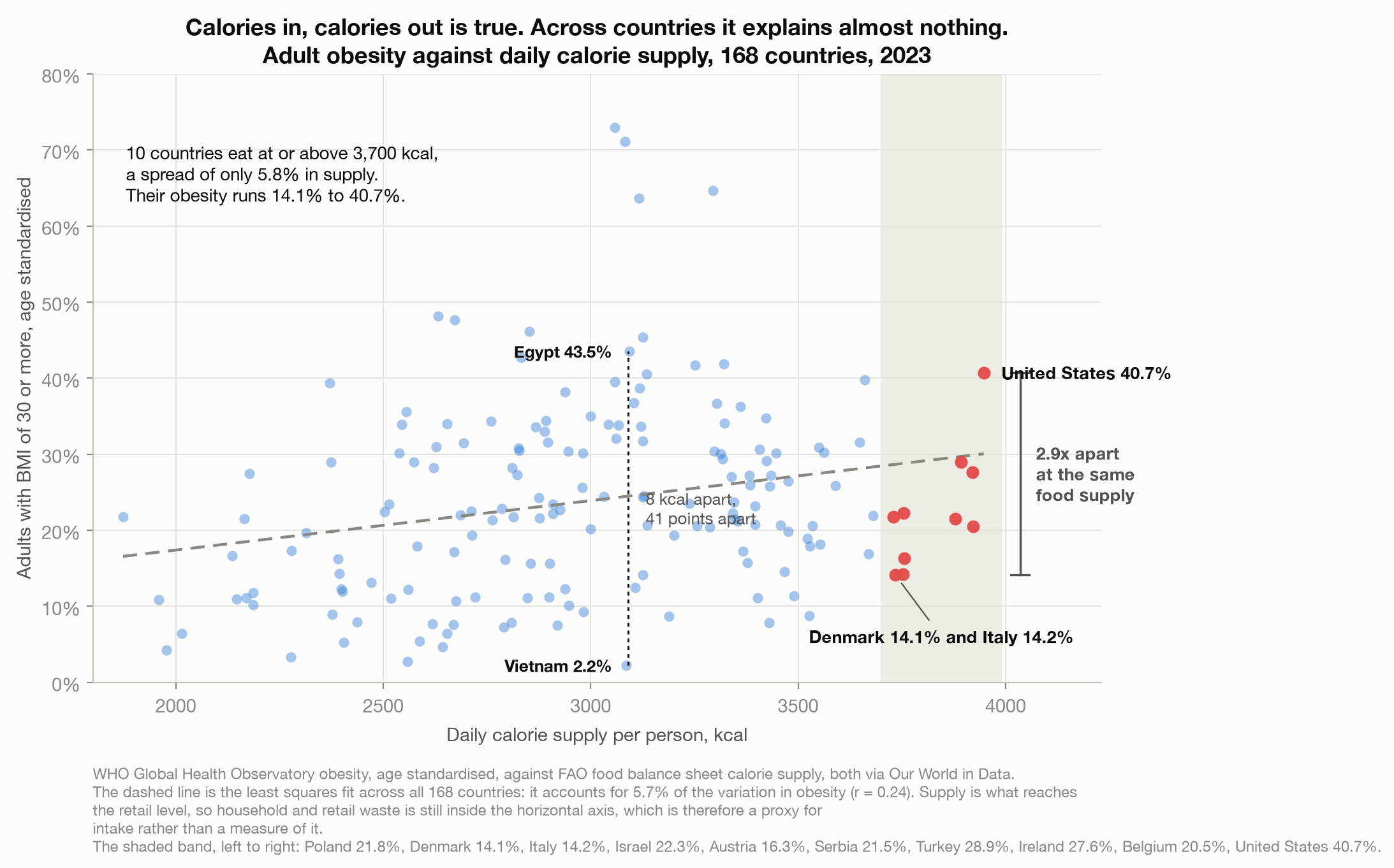
The relationship is real and it points the right way. It is also almost nothing: daily calorie supply accounts for 5.7% of the variation in adult obesity across those countries, a correlation of 0.24. Ninety-four percent of the differences between countries lie somewhere else.
The cleanest way to see it is not the fitted line but a vertical slice through the cloud. Vietnam has 3,086 calories per person per day and an adult obesity rate of 2.2%, the lowest in the sample. Egypt has 3,094 and 43.5%. Eight calories apart. Forty-one points apart. There are 69 pairs of countries in this data that sit within 30 calories of each other and more than 25 points apart on obesity, and 34 of them involve no Pacific island state at all.
I want to flag the weakest part of this before going further. The FAO food balance sheets measure food supply, what reaches the retail level, not what anyone actually eats. Household and retail waste is still inside that number, so the horizontal axis is a proxy for intake rather than a measure of it, and the gap between the two is unlikely to be the same everywhere.
I first wrote that this must inflate the apparent link between calories and obesity, and that 5.7% was therefore the generous version. I cannot show that, so I am not going to claim it. Waste that varies from country to country adds spread to the horizontal axis that carries no information about what anyone ate, and that pushes a correlation down; waste that rises with income, and so with obesity, pushes it up. Which effect wins depends on quantities these files do not contain. The honest version is narrower and less convenient: the axis is a noisy stand-in for the thing the folk theory is actually about, and I do not know the sign of the error.
The obvious objection
At this point anyone sensible says: it is not calories, it is money. Rich countries are heavier. You have found a proxy for development and mistaken it for a finding.
It is a good objection. It is also where this stops being a tidy story.
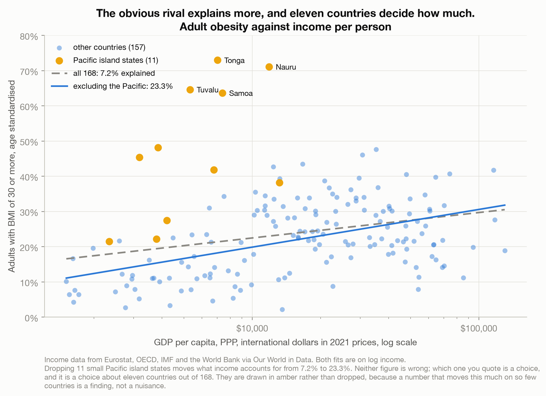
Across all 168 countries, income per person accounts for 7.2% of the variation in obesity (Eurostat et al., 2026). That is barely better than calories.
Except that figure is being held down by eleven countries. The Pacific island states are the heaviest places on earth by a wide margin, Tonga at 73.0%, Nauru at 71.1%, Tuvalu at 64.6%, Samoa at 63.6%, and they sit at middle incomes, which is precisely the position that flattens an income gradient. Take them out and income accounts for 23.3%, more than three times as much. It is worth being careful about the comparison with calories here, because it is easy to get wrong and I did at first: on those same 157 countries calorie supply explains 7.8%, not the 5.7% it manages across all 168. Income beats calories by three times on like-for-like countries, not by four.
So which number is the answer? Both of them are, and that is the point rather than a dodge. A statistic that triples when you remove 7% of your sample is telling you something about the world: that the relationship between wealth and weight is real for most countries and comprehensively broken for a specific set of them. I have drawn those eleven in amber rather than deleting them, because a reader who is only shown 23.3% has been shown a conclusion, not a result.
What I cannot do is tell you why the Pacific states sit where they do. That would need the history of imported food in those countries, and it is not in these files.
The mix does better than the total
If the amount of food does not explain much, perhaps the kind does.
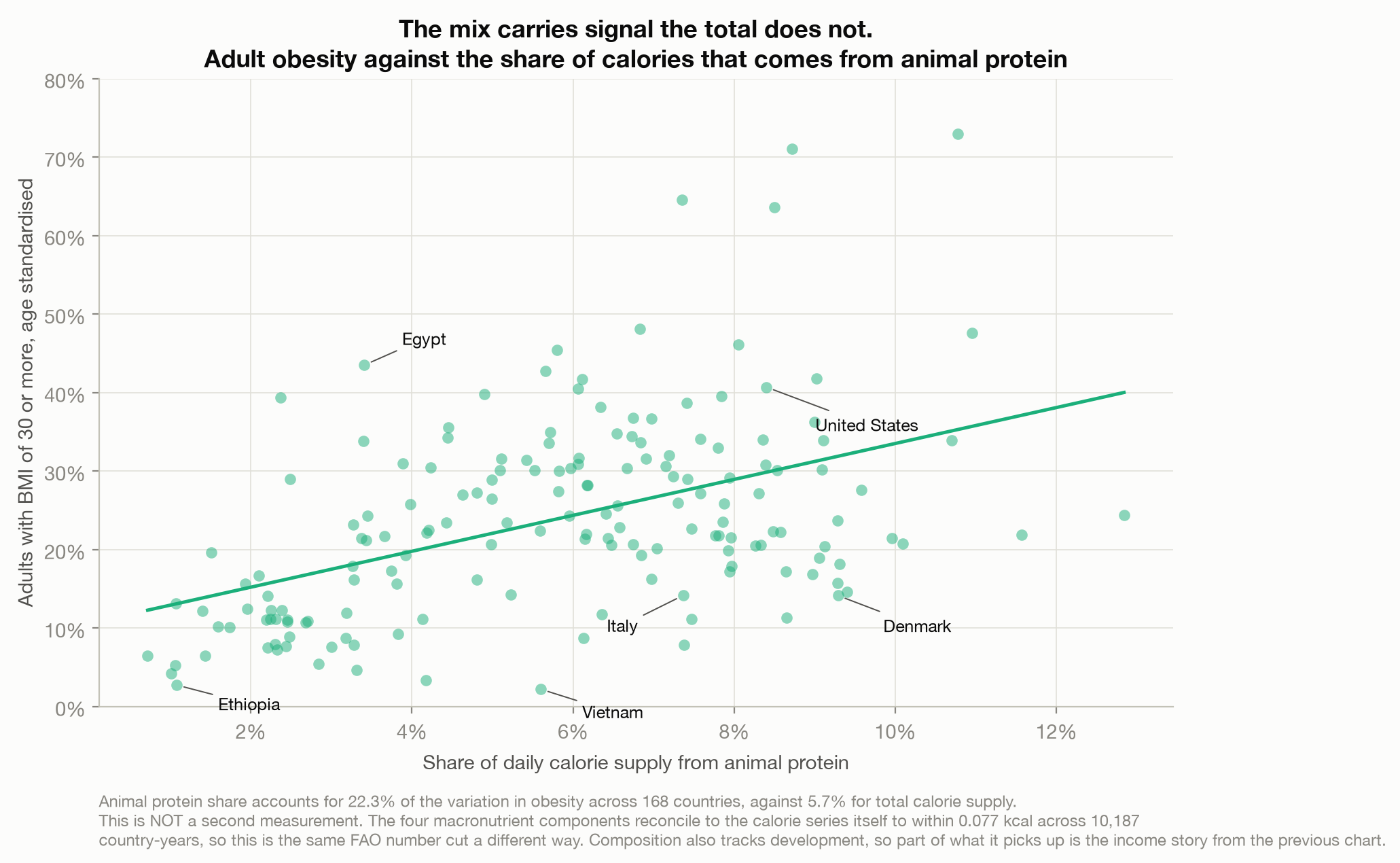
The share of calories coming from animal protein accounts for 22.3% of the variation in obesity, four times what the calorie total manages (Ritchie et al., 2023). The share from fat gives 21.0%, and the share from carbohydrate gives 22.5% with the sign reversed. Composition beats quantity, consistently.
Two honest caveats, and the first is the one that matters.
This is not a second source. The four macronutrient components sum to the calorie series itself, to within 0.077 kcal across 10,187 country-years. It is the same FAO number cut a different way. Nothing here is corroboration; it is a rearrangement.
And composition tracks development. Poorer countries eat more of their calories as carbohydrate, so part of what this chart picks up is the income story from the previous one. It is not a separate mechanism sitting neatly beside income; it overlaps with it.
Stack everything and see what is left
Three candidate explanations: how much food, how much money, what kind of food. Put all three into one fit and ask how much of the world’s variation in obesity they account for together.
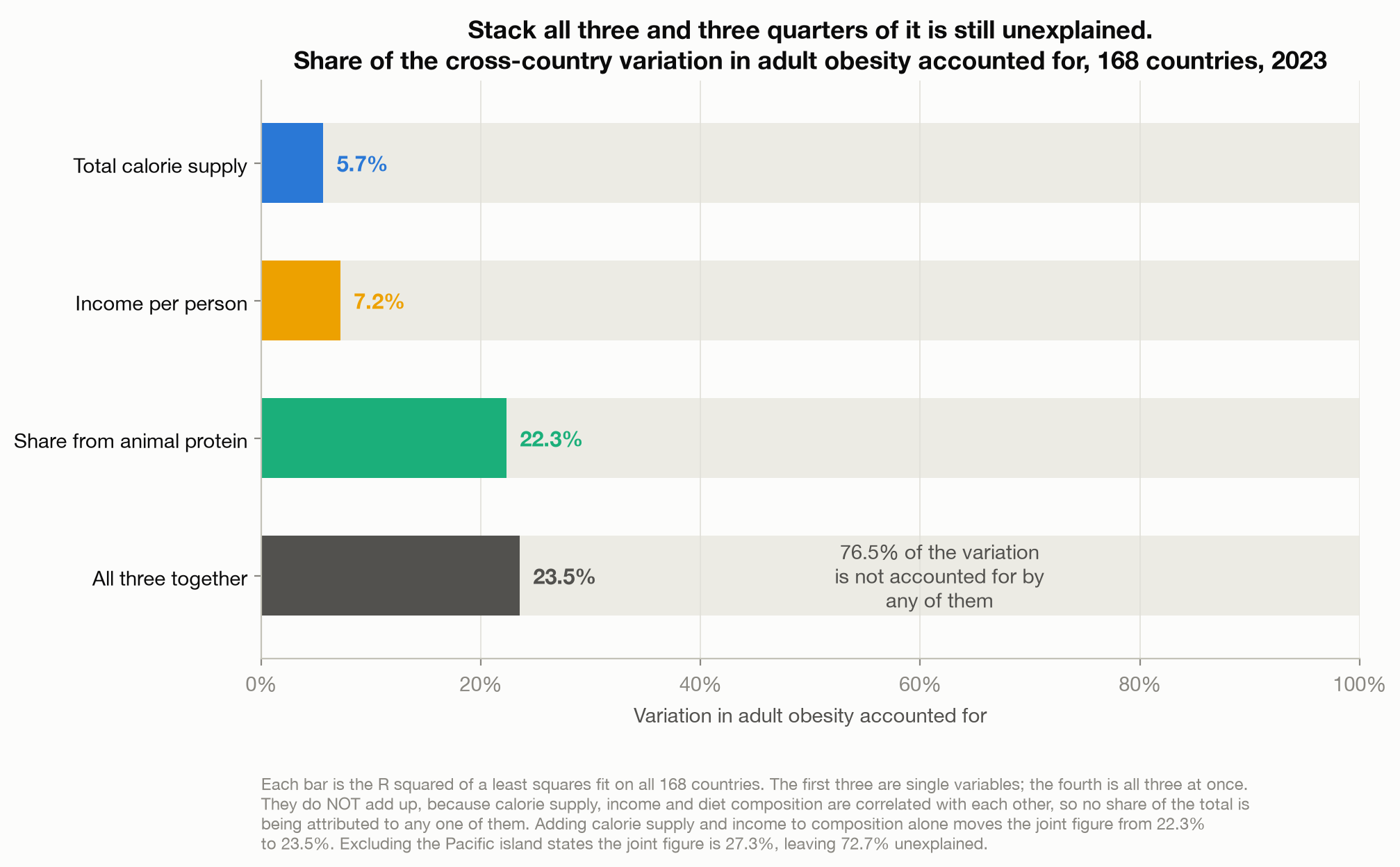
23.5%. Which is to say that 76.5% of the differences in obesity between the countries of the world are not accounted for by how much food they have, how rich they are, or what that food is made of.
Adding calorie supply and income to diet composition moves the figure from 22.3% to 23.5%. The two variables that the entire folk explanation rests on contribute about one percentage point between them once you already know what a country eats. Excluding the Pacific states the joint figure reaches 27.3%, which still leaves 72.7% unaccounted for. Re-estimated on the full 168, the same three-factor fit misses by 8.6 percentage points on average and 7.4 at the median, with a root mean squared error of 11.0, on an outcome that ranges from 2.2% to 73.0%.
Those bars do not add up, and they are not meant to. Calorie supply, income and diet composition are correlated with each other, so no share of the total is being handed to any one of them.
The residuals are worth a moment. France has an adult obesity rate of 11.3% where this model predicts 29.7%. South Korea is at 7.9% against a predicted 26.1%. Vietnam is at 2.2% against 23.7%. These are not small misses at the edges of the data; they are some of the largest economies and food cultures on earth, sitting nowhere near where food supply, income and macronutrient mix say they should.
I do not know what the missing three quarters is. Candidates are not hard to think of: what people do all day, how food is sold, how much of it is industrially processed, how cities are built, how long a country has been rich, genetics, and the plain fact that a national average is a poor summary of a country containing very different people. None of that is in these four files, and I am not going to gesture at explanations I have not tested in a post whose entire argument is that the obvious explanation was never tested.
What I actually think you should take from this
Not that calories do not matter. For any individual person, energy balance is exactly as true as it sounds, and nothing in a chart of 168 countries changes it. If you want to know whether what you eat affects your weight, this data has no opinion at all: a weak association across countries and a strong relationship inside one body are perfectly compatible, and mistaking one for the other is a named error.
The mistake is subtler, and it is the reason I wanted to write this down. Calories in, calories out is an accounting identity. It tells you how the books balance. It is true by definition, and it is true by definition in every country, which is exactly why it cannot explain why the countries differ. An identity that holds everywhere has no variation left in it to do explanatory work. Denmark and the United States both obey energy balance perfectly. They obey it at 14.1% and 40.7%.
The identity is the accounting. The explanation is whatever determines the terms that go into it, and that is the part nobody has to hand.
This generalises well past food, which is why it is worth keeping. GDP is defined as consumption plus investment plus government spending plus net exports, and that identity explains no country’s growth. Revenue minus cost is profit, and no firm ever improved by being told so. A budget balances by construction, and the construction is not a policy. Any time an explanation feels satisfying and turns out to be true by definition, it is doing arithmetic rather than work, and the interesting question is one level down: not whether the books balance, but what is setting the numbers that have to.
A true equation is not a reason. They are different things, and only one of them tells you anything you did not already know.
Method notes
The obesity series is age standardised, and the default one is not. Our World in Data’s headline obesity chart serves the crude prevalence, which is not adjusted for age structure. Since obesity rises with age across most of the adult range and countries differ enormously in how old their populations are, a crude comparison puts demography on the axis. The two series correlate 0.9909, which is why this is easy to miss, but individual countries move by up to 6.1 points, and the direction is not random: Greece reads 33.3% crude against 27.2% standardised because its population is old, while Palestine reads 33.0% against 37.2% because its is young. Every figure in this post uses the age-standardised series. Those comparison figures are computed across the 199 countries carrying both estimates for 2023, a wider set than the 168-country panel; Palestine is one of the 31 in it that the panel does not reach.
Food supply is not food intake. FAO food balance sheets track what reaches the retail level. Household and retail waste is inside the number, so the calorie axis is a proxy for intake rather than a measure of it. As the body explains, whether that pushes the reported relationship up or down cannot be settled from these files, so nothing here should be read as the conservative or the generous version.
BMI of 30 or more is a threshold on a continuous measure, and BMI does not measure body fat. A prevalence figure can move because the whole distribution shifted or because a lot of people happened to sit just under the line.
This is an ecological comparison and nothing else. Every number here is an association between country-level averages. None of it identifies a cause, and none of it describes an individual.
Aggregates were filtered out. The FAO extracts carry 52 non-country entities in the same column
as countries, including World, continents, and FAO regional groupings; the income file adds World
Bank income groups, and the WHO obesity files add six regional aggregates. Only rows with a genuine
three-letter country code are kept. An earlier version of this note claimed Kosovo was a real
country lost to that rule; it was not, and the claim flattered the method. Kosovo has no rows at
all in the obesity file or in either FAO file, so it could never have entered. The countries
genuinely lost are the four that have both an obesity and a calorie figure for 2023 but no income
figure: French Polynesia, Syria, Venezuela and Yemen. Three of the four sit above the sample’s
median obesity, so the exclusion is not neutral. French Polynesia is the sharpest case: at 48.6% it
is heavier than any country that did make the panel except the four Pacific states, and it is
itself a Pacific territory, so its absence thins out precisely the cluster the income chart turns
on. What its inclusion would have done to the 23.3% I cannot tell you, and neither can anyone else
from these files, because the missing income figure is the very reason it drops out. There is no
income to place it at.
The macronutrient shares are a decomposition, not a second measurement. The four components sum to the calorie series to within 0.077 kcal across 10,187 country-years.
Single-variable and joint figures do not add. The three predictors are correlated with one another, so the joint fit is reported as one number and no share of it is attributed to any single variable.
Sample. 168 countries, the 2023 observations carrying an obesity rate, a calorie supply and an income figure. The macronutrient file is present for all of them too but excludes nobody, since its 2023 coverage matches the calorie file’s exactly. 2023 is the latest year the four overlap: the obesity series runs to 2024 and the income series to 2025, but the FAO data stops at 2023. Eleven of the 168 are Pacific island states, reported separately wherever their inclusion changes a result.
What this cannot tell you. Why any country sits where it does. The model leaves roughly three quarters of the variation unexplained, and the post treats that remainder as an open question rather than filling it with plausible-sounding candidates.
References
Eurostat, Organisation for Economic Co-operation and Development, International Monetary Fund, & World Bank. (2026). GDP per capita, PPP (constant 2021 international $) [Data set]. Processed by Our World in Data. https://ourworldindata.org/grapher/gdp-per-capita-worldbank
Food and Agriculture Organization of the United Nations. (2025). Food balance sheets [Data set]. Processed by Our World in Data. https://ourworldindata.org/grapher/daily-per-capita-caloric-supply
Ritchie, H., Rosado, P., & Roser, M. (2023). Diet compositions. Our World in Data. Retrieved August 5, 2026, from https://ourworldindata.org/diet-compositions
Ritchie, H., & Roser, M. (2017). Obesity. Our World in Data. Retrieved August 5, 2026, from https://ourworldindata.org/obesity
World Health Organization. (2026). Global Health Observatory: Prevalence of obesity among adults, BMI >= 30, age-standardized estimate [Data set]. Processed by Our World in Data. https://ourworldindata.org/grapher/obesity-prevalence-adults-who-gho
// About the author
Jonathan Chrisnaldy is a product manager and analyst in New York City, with an M.S. in Technology Management from Columbia University. He writes data stories about the numbers behind everyday claims. More on the experience page or LinkedIn.