· 16 min read · Jonathan Chrisnaldy
How Scandinavia Actually Pays for Itself, and What Others Can Learn From It
In 2025 Denmark's top tax rate started at 1.24 times the average wage. In the United States, 8.73. Both countries have a top bracket; the word does entirely different work in each. Denmark raises 25.0% of GDP from personal income tax, the highest in the OECD, and 0.06% from social contributions. Read every labour tax together and Denmark, Sweden, Finland, Germany and France land within 1.56 points of each other.
In 2025 the OECD put Denmark’s top statutory rate on labour income at 55.9% of gross wage earnings. That is the number everyone quotes. The one next to it is the number nobody quotes: that rate began at 1.24 times the average wage. In the United States, the top federal bracket began at 8.73 times average pay.
Both countries have a top bracket. The word does entirely different work in each, and before you argue about whether a country taxes too much you have to know who it points at. I went looking for how the Nordic model is financed, and the revenue tables kept correcting me.
Where the top bracket begins
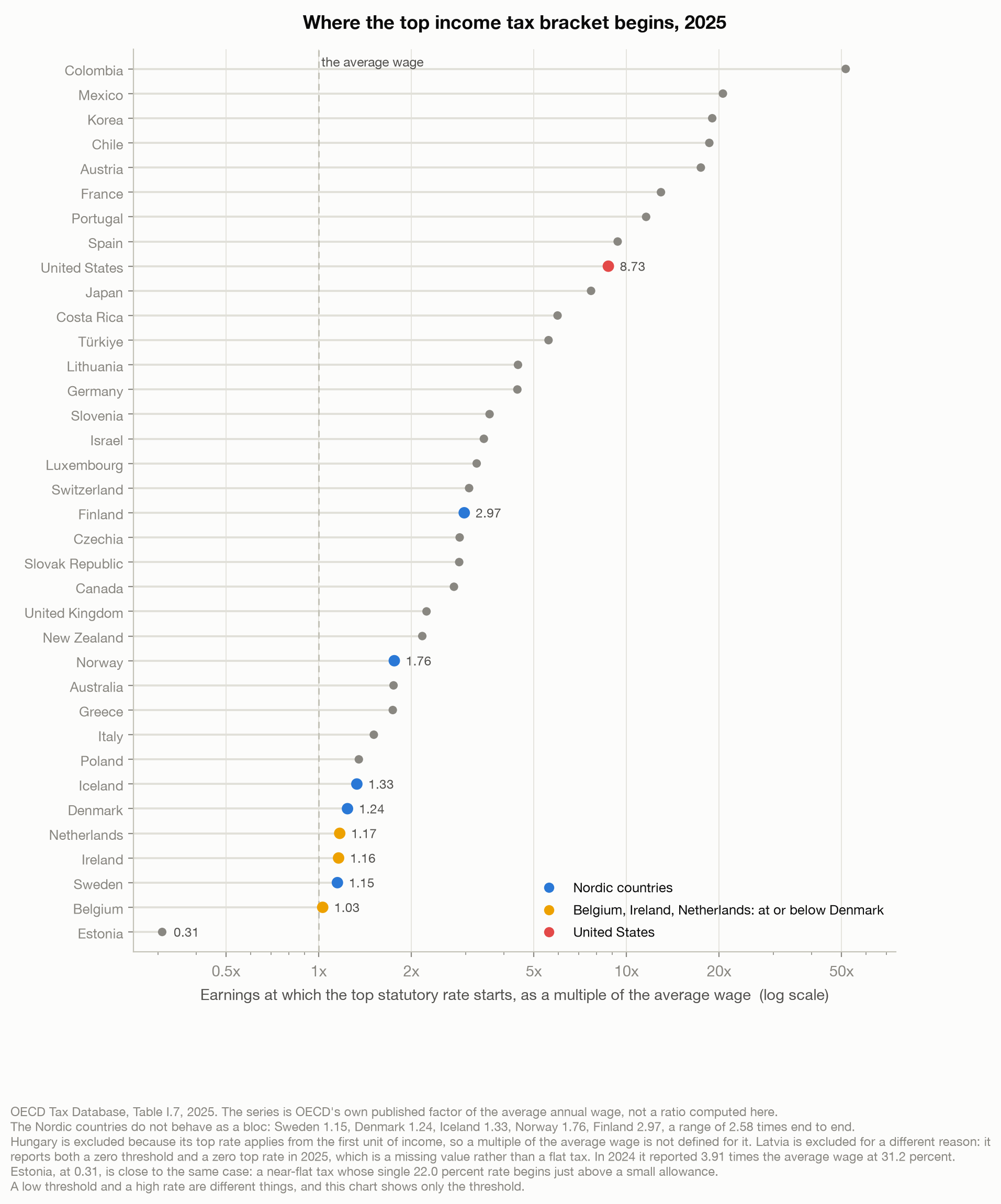
The Nordics are not a bloc. Sweden starts at 1.15 times the average wage, Denmark 1.24, Iceland 1.33, Norway 1.76, Finland 2.97, a range of 2.58 times end to end. Finland sits closer to Canada than to Sweden, so any sentence beginning “the Nordics” has to survive it.
And a low threshold is not a Nordic invention. Belgium begins at 1.03, Ireland 1.16, the Netherlands 1.17, all at or below Denmark. Nor is it only Northern European: Hungary taxes from the first unit of income. The lowest threshold actually on the chart is Estonia’s, a single 22% rate from 0.31. Hungary is off it for that reason, Latvia because its 2025 threshold and rate are both reported as zero, so the chart holds 36 of the 38. A low threshold and a high rate are different things; this chart shows the threshold.
One change matters more than a footnote should. In January 2026 Denmark split its single top bracket, a 15% topskat, into three tiers, all stated after the 8% labour market contribution: a middle tax of 7.5% above DKK 641,200, on personal income plus positive net capital income over DKK 55,000 for a single taxpayer and DKK 110,000 for a couple; a top tax of 7.5% above DKK 777,900 on personal income, stacking back to 15; and a top-top tax of 5% above DKK 2,592,700. Its highest rate now starts far higher up and is higher, about 60.5% of gross wage earnings against 55.9 in 2025. For income between DKK 611,800 and 777,900 the reform is a cut, though DKK 641,200 is only DKK 611,800 indexed forward. The 2025 figure above is DKK 611,800 of personal income, DKK 665,000 gross, against a DKK 537,071 average wage.
OECD has published no 2026 figure, so I will not draw a line across the break. If it reports the new top-top tier the multiple jumps from 1.24 to about five, my own calculation from the statutory threshold and a projected 2026 average wage. The lesson is not about Denmark: an indicator built on “the threshold of the highest rate” can quadruple because a country added a small surtax at the very top, while the person on average pay notices nothing.
How the money is actually raised
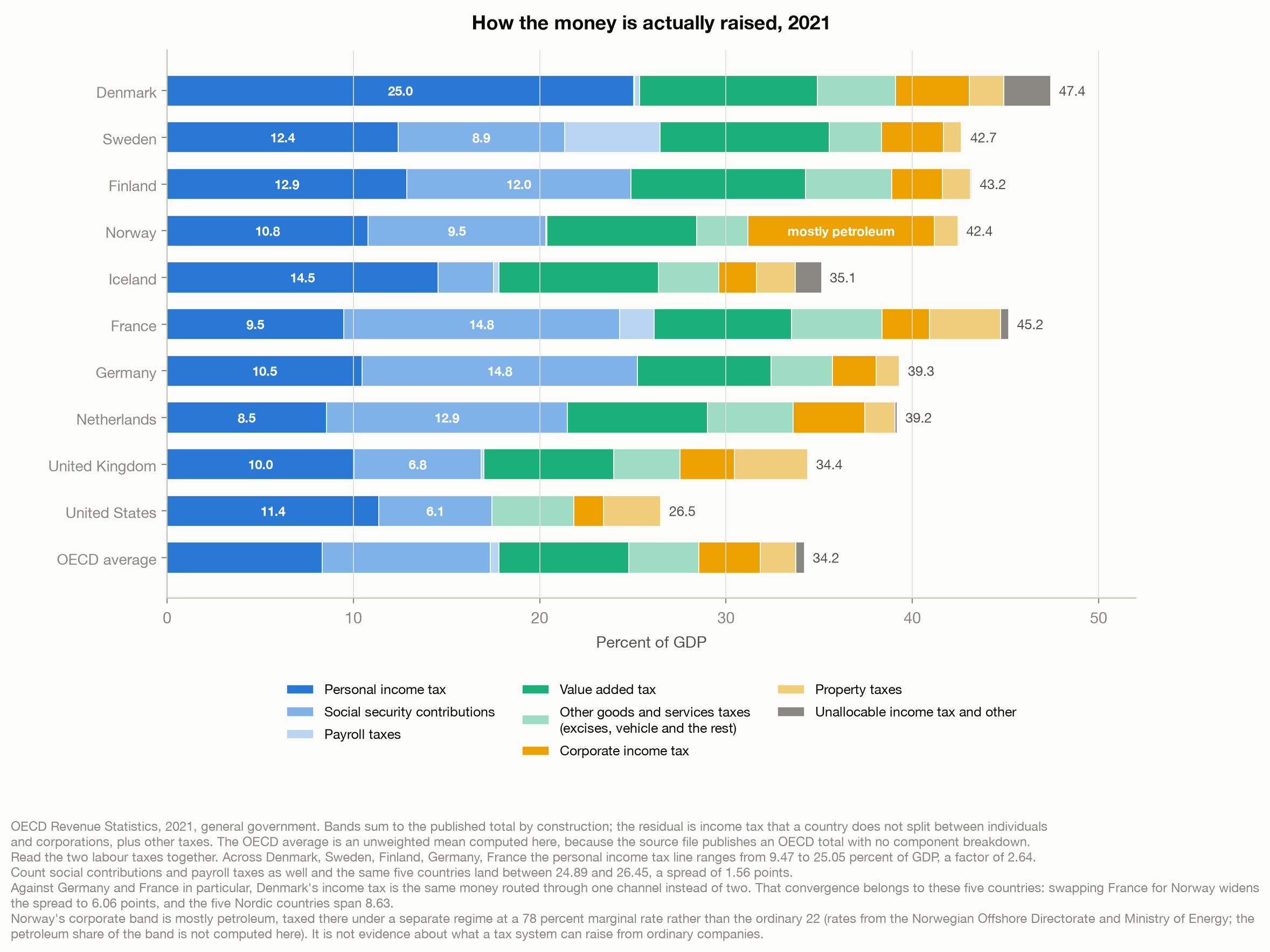
Denmark raised 25.0% of GDP from personal income tax in 2021, the highest in the OECD and not narrowly: second-placed Iceland is at 14.5, the average 8.3. It also raised 0.06% of GDP in social contributions. Not a rounding artefact: essentially zero.
Germany raised 10.5% in income tax and 14.8 in contributions. France, 9.5 and 14.8. Read one line and Denmark looks like a wild outlier. Now read every labour tax together:
| Personal income tax | Social contributions | Payroll | Together | |
|---|---|---|---|---|
| Denmark | 25.05 | 0.06 | 0.26 | 25.36 |
| Sweden | 12.40 | 8.93 | 5.12 | 26.45 |
| Finland | 12.86 | 12.03 | 0.00 | 24.89 |
| Germany | 10.47 | 14.77 | 0.00 | 25.25 |
| France | 9.47 | 14.82 | 1.84 | 26.13 |
Percent of GDP, 2021. Figures are rounded individually, so two rows do not appear to add; totals are computed unrounded.
Their income tax lines differ by a factor of 2.64, their total taxation of labour by 1.56 points. Against Germany and France, Denmark’s income tax is not extra burden but the same money routed through one channel instead of two.
Two qualifications, because that table is a comparison I chose. The convergence belongs to those five: swapping France for Norway widens the spread to 6.06 points, the five actual Nordics span 8.63, and across all 38 the ratio between largest and smallest income tax line is 18.96. And routing is not the whole of Denmark: its income tax runs 16.7 points above the OECD average while the contributions it skips are worth 9.0, so routing accounts for about 54% of the excess. Denmark ranks fourth of 38 on labour taxes and first on total tax, a heavy-taxing country, just not in the way the income tax line alone suggests.
What the revenue buys, and what it only appears to buy
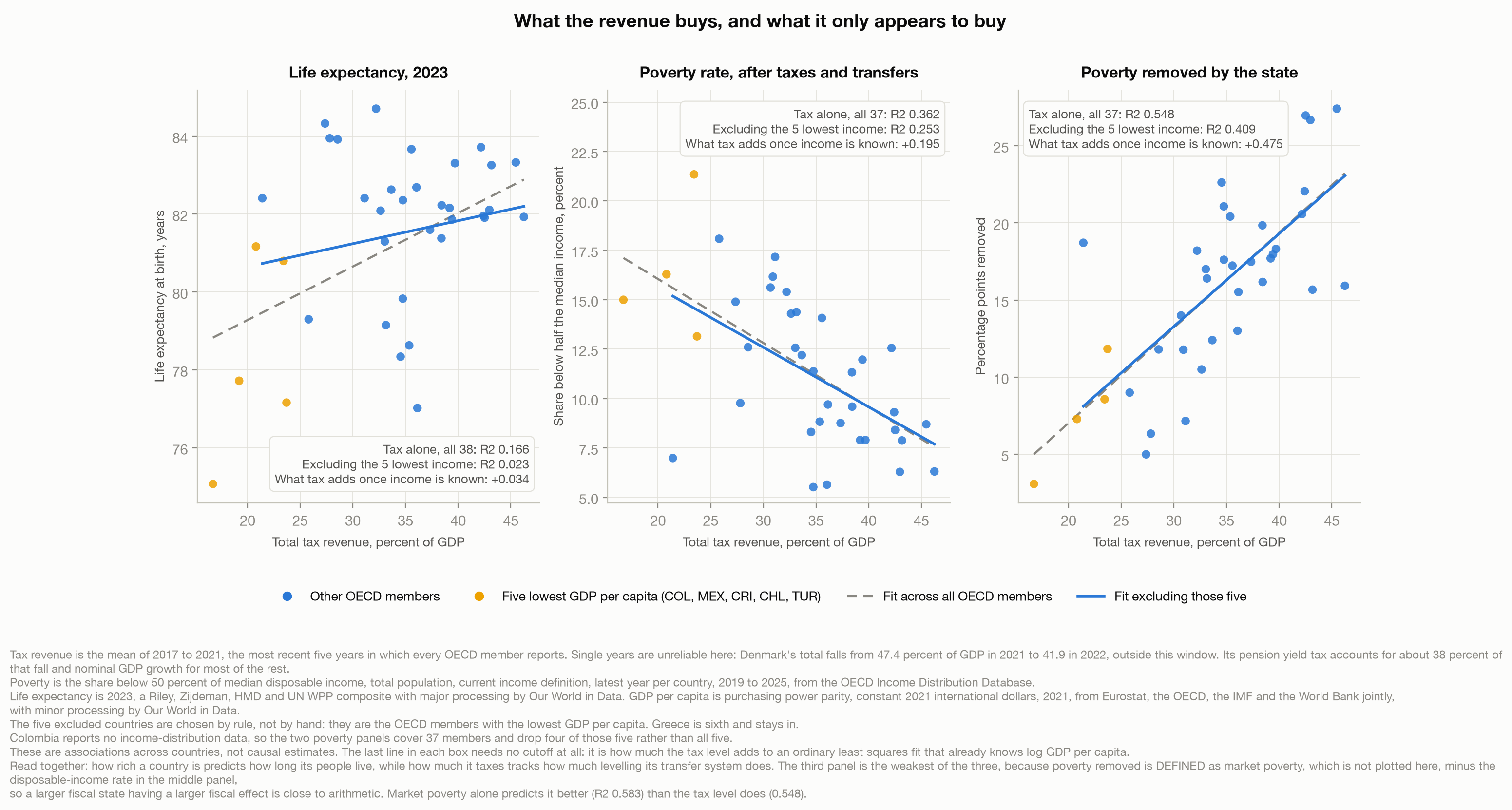
Plot tax revenue against life expectancy across all 38 OECD members and you get R-squared 0.166. Taxing more, it appears, buys longer life.
It does not. Remove the five members with the lowest GDP per capita, Colombia, Mexico, Costa Rica, Chile and Türkiye, and it falls to 0.023. The relationship was never about tax; it was that the low-tax end of the OECD is also the low-income end. Control for log GDP per capita, so no cutoff has to be defended, and tax adds 0.034, noise on 38 countries.
The same test belongs on the other side: life expectancy against income alone is 0.291 across all 38 and 0.143 once those five leave. The income story survives the cut better than the tax story, but it halves too.
Denmark is the concrete case. It collects more than any other OECD member on the five-year average this chart uses, and lives 81.9 years, twentieth of 38, behind Japan 84.7, Korea 84.3 and Switzerland 84.0. It does take market poverty from 22.2% to 6.3.
The finding I have to argue against myself
That last number is weaker than it looks. “Poverty removed by the state” is market poverty minus disposable poverty, and disposable income is market income plus transfers minus taxes. So the thing explained is the output of the tax and transfer system, and the thing explaining it is that system’s size. Market poverty alone, measured before the state acts, predicts it slightly better (0.583) than the tax level does (0.548), and high-tax countries have more of it to remove in the first place, at a correlation of 0.45.
It is not purely circular. The fit is 0.55, not 1.0, and the counterexample is in the data: France collects 45.5% of GDP and removes 27.4 points of poverty, Denmark 46.2 and 15.9. Size correlates with redistributive output; it does not determine it.
So the honest headline is not the symmetry I first wrote. How rich a country is predicts how long its people live. How much it taxes tracks how much levelling its transfer system does, a smaller and more mechanical claim, and the next section is where it stops being circular.
Why there is no schooling panel
PISA lets countries exclude up to 5% of their target population. In 2022 Denmark excluded 11.6%, and the OECD says dyslexic students using assistive devices the test does not accommodate appear to be a major cause of the rise from 5.7% in 2018 (OECD, 2023).
That is an upward bias on a country 12.7 points of GDP above the average on this chart’s x axis. Lifting the y value of a high-x country tilts the fitted line upward, pushing the panel toward showing that tax buys learning. A panel I would have to caveat into uselessness is worse than a paragraph explaining its absence.
Where the equalising actually happens
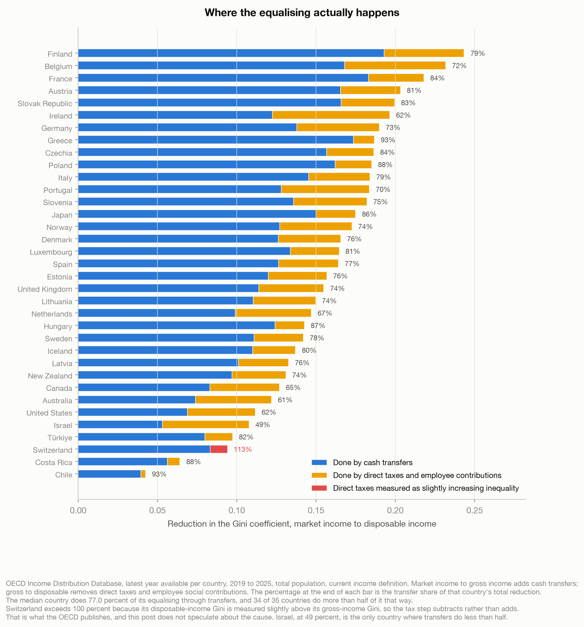
Split the journey from market to disposable income into the part done by cash transfers and the part done by direct taxes and employee contributions. Across 35 OECD countries the median does 77% of its inequality reduction through transfers, 34 of 35 more than half. Denmark 76%, Finland 79, the United States 62.
This locates the previous section’s weak result without rescuing it. The tax level tracks the transfer step (0.497) and barely the tax step (0.066); decomposed properly, 86% of the covariance runs through transfers. The same near-definitional pairing, at a lower fit.
The 77% is a different claim, and it is not circular. It is a composition inside each country, with no tax level on either side: of the equalising a country does, this much comes through transfers. Nothing in the accounting requires 77 to 23 rather than the reverse.
What travels
A universal benefit needs a universal bill. If a state covers everyone the money has to come from the middle, because that is where the taxpayers are. That is my prior, not a finding: nothing here measures what share of the bill each income group carries, only how much is collected and what it does.
The testable version does not survive. If collecting a lot forced a low top bracket, the two would move in opposite directions. Across the 31 richer OECD members the correlation is minus 0.06, the right sign and no size: it accounts for 0.3% of the variation. France collects 45.5% of GDP with a top bracket at 12.94 times the average wage, Austria 42.4% at 17.44, both top-ten collectors. Two caveats: across all 36 members the correlation is minus 0.47, carried by the same five low-income countries excluded above; and this threshold is the income tax schedule’s alone, the least comparable line in the table. Denmark chose a broad base.
What does look transferable is the other half, equalising through what the state pays out rather than how steeply it taxes. What does not is the capacity to collect and the consent underneath it.
Indonesia’s entire tax take averaged 11.2% of GDP across 2017 to 2021, of which personal income tax was 1.1. Denmark’s income tax alone, over the same five years, was 24.7% of Danish GDP: 2.2 times Indonesia’s whole tax take, 22.7 times its own income tax.
The argument about tax I most often hear at home is an argument about the rich, and the Danish tables are uncomfortable about that: the rich are not where a universal state gets its money, in Copenhagen or Jakarta. The harder question is not the rate anyone will set. It is whether a state can reach ordinary earners at all, and whether what it hands back is worth what it takes.
Method notes
Five time bases. Thresholds 2025, revenue 2021, life expectancy 2023, a 2017 to 2021 mean tax level, income-distribution data at each country’s latest year (2019 to 2025). Revenue is 2021 because 2022 drops Japan, Australia and Greece. The tax level is a five-year mean because Denmark’s single year falls from 47.4% of GDP to 41.9 between 2021 and 2022, outside this window, about 38% of that its pension yield tax following markets and most of the rest nominal GDP growth; Denmark ranks first on either window, leading France by 0.77 points on 2017 to 2021 and 0.05 on 2018 to 2022.
The threshold is OECD’s published series, not a ratio I computed: Danish law states it net of the 8% contribution while the average wage is gross, so dividing one by the other returns 1.139, not 1.238. The DKK 665,000 gross equivalent is derived, not legislated.
Definitions sit on the figures: the poverty line and income definition on the third, Norway’s petroleum and the Switzerland exception on the second and fourth. Personal income tax throughout is the wider OECD category, including capital gains, reported by all 38.
These are associations, not causal estimates, including in “What travels”. The strongest claim I will defend: tax revenue does not predict longevity once you know how rich a country is, explaining 0.023 among the 33 richer members. What it predicts is how much levelling the transfer system does.
The analysis, the four charts and every number above are reproduced by the code in the data-stories repository. The source files are not redistributed; a fetch script downloads them from the OECD and Our World in Data.
References
Eurostat, Organisation for Economic Co-operation and Development, International Monetary Fund, & World Bank. (2026). GDP per capita, PPP (constant 2021 international $) [Data set]. With minor processing by Our World in Data. https://ourworldindata.org/grapher/gdp-per-capita-worldbank
Norwegian Offshore Directorate, & Ministry of Energy. (2026). The petroleum tax system. Norwegianpetroleum.no. https://www.norskpetroleum.no/en/economy/petroleum-tax/
Organisation for Economic Co-operation and Development. (2023). PISA 2022 results (Volume I): The state of learning and equity in education. OECD Publishing. https://doi.org/10.1787/53f23881-en
Organisation for Economic Co-operation and Development. (2026a). OECD income distribution database [Data set]. https://sdmx.oecd.org/public/rest/data/OECD.WISE.INE,DSD_WISE_IDD@DF_IDD,1.0/all
Organisation for Economic Co-operation and Development. (2026b). OECD tax database, Table I.7: Top statutory personal income tax rates [Data set]. https://sdmx.oecd.org/public/rest/data/OECD.CTP.TPS,DSD_TAX_PIT@DF_PIT_TOP_EARN_THRESH,1.0/all
Organisation for Economic Co-operation and Development. (2026c). Revenue statistics: Comparative tables [Data set]. https://sdmx.oecd.org/public/rest/data/OECD.CTP.TPS,DSD_REV_COMP_OECD@DF_RSOECD,1.0/all
Organisation for Economic Co-operation and Development. (2026d). Revenue statistics in Asia and the Pacific: Comparative tables [Data set]. https://sdmx.oecd.org/public/rest/data/OECD.CTP.TPS,DSD_REV_COMP_ASAP@DF_RSASAP,1.0/all
Riley, J. C., Zijdeman, R., Human Mortality Database, & United Nations Department of Economic and Social Affairs, Population Division. (2025). Life expectancy at birth [Data set]. With major processing by Our World in Data. https://ourworldindata.org/grapher/life-expectancy
Skatteministeriet. (2024). Lov nr. 482 af 22. maj 2024 om ændring af personskatteloven, ligningsloven og forskellige andre love. Retsinformation. https://www.retsinformation.dk/eli/lta/2024/482
Skatteministeriet. (2025). Satser og beløbsgrænser i lovgivningen: Personskatteloven. https://skm.dk/tal-og-metode/satser/satser-og-beloebsgraenser-i-lovgivningen/personskatteloven
// About the author
Jonathan Chrisnaldy is a product manager and analyst in New York City, with an M.S. in Technology Management from Columbia University. He writes data stories about the numbers behind everyday claims. More on the experience page or LinkedIn.