· 17 min read · Jonathan Chrisnaldy
A Quarter of the Median County's Income Is a Transfer. Nearly Half of That Is Paid to a Provider.
BEA defines personal income as the income received by, or on behalf of, all persons. Everyone quoting a county income figure says the first half. In the median American county transfers are now 26.2% of personal income, and nearly half of those are medical benefits paid to providers rather than handed to the people they are counted for.
The Bureau of Economic Analysis defines personal income in sixteen words, and the argument of this whole piece is hiding in three of them.
“Personal income is the income received by, or on behalf of, all persons from all sources …”
The sentence runs on, listing where the income comes from, but those sixteen words are the whole definition of what counts.
On behalf of. Everyone quoting a county income figure hears the first half of that phrase. Almost nobody repeats the second.
What is in the number
BEA publishes personal income for almost every American county back to 1969, 3,109 of the 3,149 in the file, and separately publishes the transfer component broken out benefit by benefit: Social Security, Medicare, public assistance medical care, unemployment insurance, food stamps, the earned income tax credit, veterans’ benefits. I found the tables through Data Is Plural (Singer-Vine, 2021). Everything is free, and nothing here required anything but their own files.
In 1969, personal current transfer receipts were 7.9% of all American personal income. In 2022 they were 18.1%. The median county went from 9.9% to 26.2%. Almost all of that is from governments, 92.6% of the total in 1969 and 96.1% in 2022, with the rest coming from businesses or going to nonprofit institutions; I use the full total throughout and call it transfers.
Those two figures differ for a reason worth pausing on, and it is mostly size rather than wealth. Switch from the median county to the average one, 26.4% against 26.2%, then weight that average by population and it falls to 19.9%; weight it by income, which is what a ratio of national totals does, and it falls to 18.1%. The population step alone accounts for 79% of the gap. Wealth matters too, since transfer share falls as counties get richer (correlation -0.67 against income per head, -0.77 against its logarithm, -0.81 on ranks) and the richest tenth of counties sits at a median of 13.8%. Los Angeles County is at 19.2%, Cook County at 16.2%, Harris County at 13.0%. The national headline is pulled down by the big places, and the typical county is well above it.
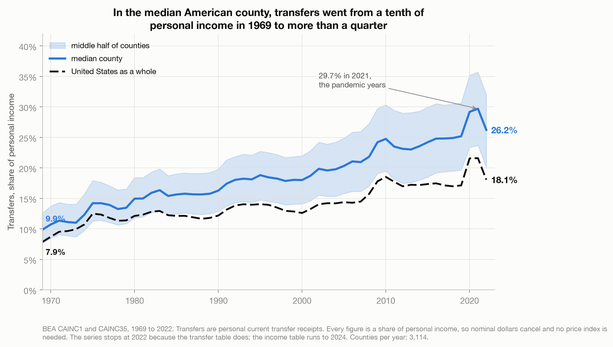
The spike at the right-hand end is the pandemic. Transfers reached 29.7% of income in the median county in 2021, on emergency unemployment insurance and refundable tax credits, and then fell back to 26.2% by 2022 as those programmes expired. It is the largest excursion in the series and it is not the subject here. Cover the last three years and the line underneath still climbs from a tenth to a quarter.
More than a quarter. That is the first number, and on its own it is the kind of statistic that gets used to argue about dependency. The second number is the one that changed how I read the first.
Nearly half of it is paid to a provider
BEA sorts transfers into benefit types, and one of those types behaves unlike the rest. Medical benefits are Medicare, public assistance medical care (mostly Medicaid) and military medical insurance. BEA’s published methodology books all three as vendor payments. Of Medicare it says the benefits are “payments made directly or through intermediaries to vendors for the care provided to individuals” (Bureau of Economic Analysis, 2026b, para. 5.13). Medicaid is described almost identically, as consisting mainly of payments to vendors, and military medical insurance is called vendor payments outright. Money paid to the provider, not handed to the person treated. The footnote on the public assistance line reads “Consists of Medicaid, beginning in 1966, and other medical vendor payments” (Bureau of Economic Analysis, 2026b, table H, note 2). The money is counted as your income and delivered to your hospital.
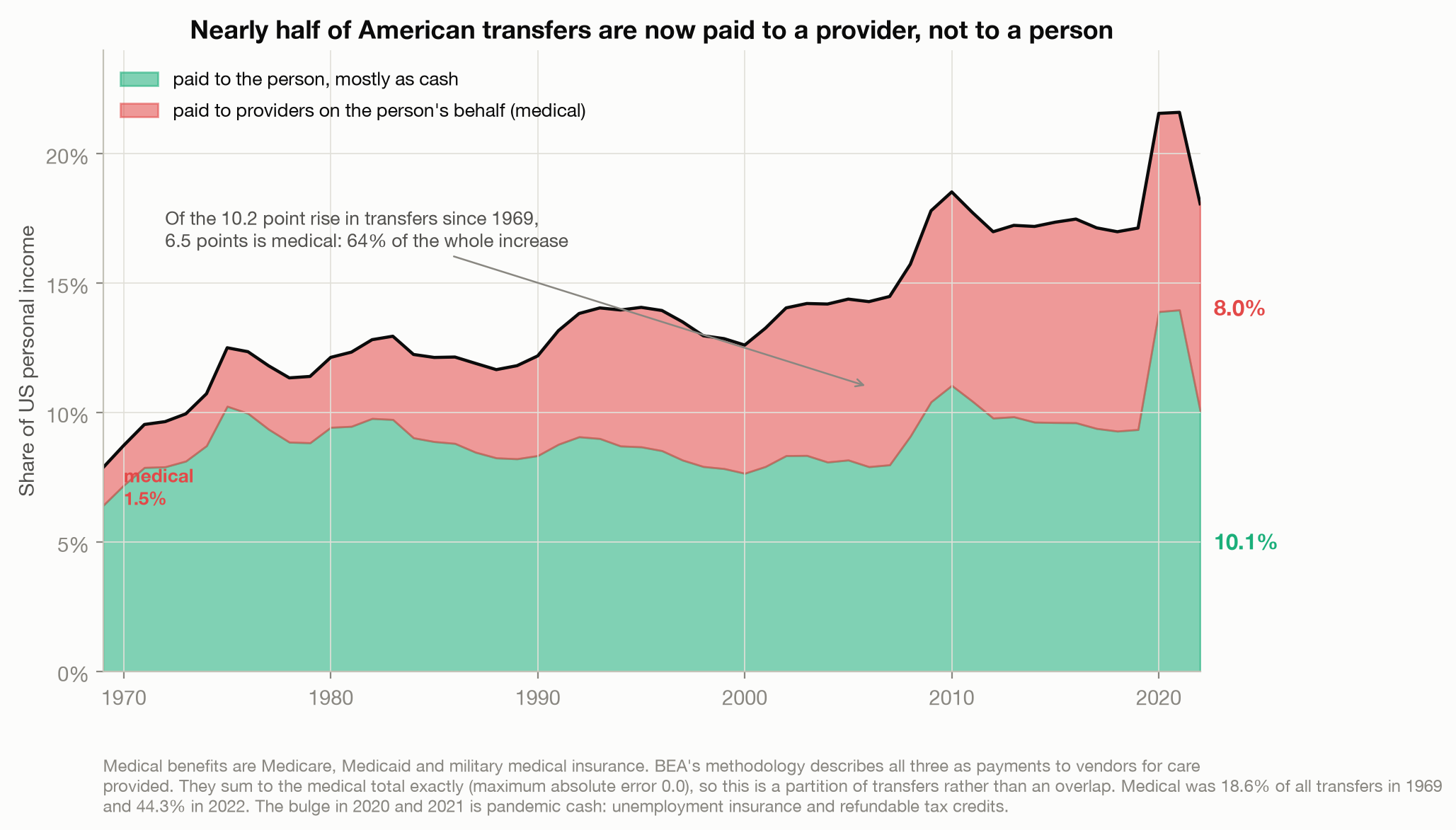
In 1969, medical was 1.5% of American personal income and 18.6% of all transfers. In 2022 it was 8.0% of personal income and 44.3% of all transfers. Of the 10.2 percentage points by which transfers grew over those years, 6.5 points is medical: 64% of the entire increase.
Which means the category most people argue about is the smallest of the big movers:
| 1969 | 2022 | Change | |
|---|---|---|---|
| Medicare | 0.85% | 4.18% | +3.34 |
| Medicaid and other medical vendor payments | 0.59% | 3.74% | +3.15 |
| Social Security | 3.33% | 5.47% | +2.14 |
| Income maintenance (SSI, EITC, SNAP, TANF) | 0.92% | 2.03% | +1.11 |
| Unemployment insurance | 0.29% | 0.10% | -0.19 |
| everything else (education, veterans, other) | +0.65 |
Income maintenance, the welfare bucket, moved 1.1 points in 53 years. Medical moved 6.5. Whatever the rise in American transfers is a story about, it is mostly a story about health care, and only marginally about the programmes that dominate the argument. These files cannot tell you how much of the health care growth is prices and how much is coverage, and I am not going to guess.
I want to be careful here, because there is a lazy version of this observation and it is wrong. None of this money is fake. Medicaid pays for treatment that happened, to people who received it. There is a decent case for counting the value of health coverage as part of what a person gets, and BEA follows its own documented convention and says so in public.
It is worth knowing that the international standard draws the line the other way. Under the System of National Accounts, benefits like these are “social transfers in kind”, goods and services provided to households by government free or nearly free, and they are kept out of household disposable income. They surface only in a separate balancing item called adjusted disposable income, which is defined as disposable income plus the social transfers in kind you receive (European Commission et al., 2009, paras. 8.32, 8.141). So the instinct that this money is not quite yours to spend is not naive. It is the line the international standard draws, and the headline the United States quotes puts it somewhere else.
The problem, either way, is not the accounting. It is that the result is called personal income, and personal income sounds like money you could spend.
It happened everywhere
The instinct on seeing high transfer shares is to picture Appalachia, and eastern Kentucky really is the extreme. Martin County has the highest transfer share in the country at 62.2%, and Owsley County is just behind at 61.4% with 41.0 of those points medical, the highest medical share of personal income of any county in America. But treating this as a story about a few poor counties gets it backwards.
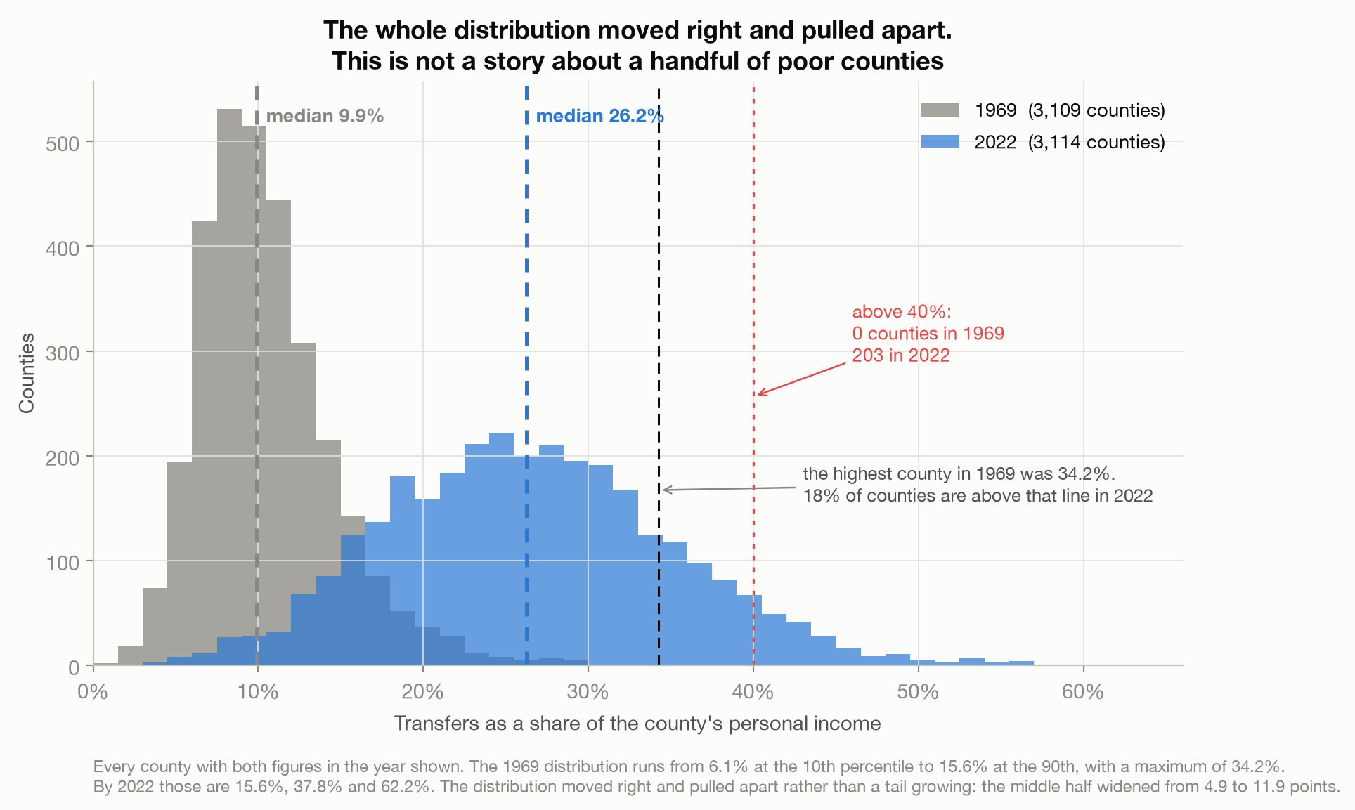
The two distributions share about a fifth of their mass. In 1969 the most transfer-dependent county in America was at 34.2%. By 2022, 18% of all counties were above that line, and 203 of them were above 40%, a level no county reached in 1969. This is not only a tail that grew. The whole distribution moved right and pulled apart at the same time: the 10th percentile rose 9.6 points, the median 16.4 and the 90th percentile 22.2, so the spread between counties more than doubled while every part of it climbed.
The same number, meaning different things
Here is where the definition starts to bite.
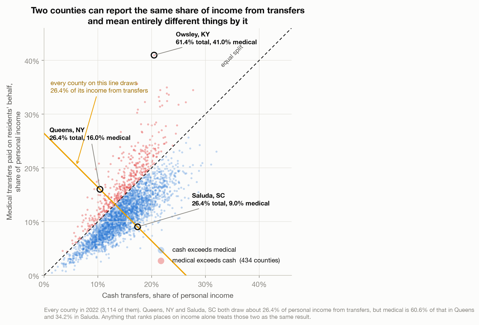
Queens County, New York and Saluda County, South Carolina both draw about 26.4% of personal income from transfers. On any ranking that uses the headline figure they are the same result.
They are not remotely the same. In Queens, 60.6% of those transfers are medical, so 16.0% of all personal income in the borough is money paid to health care providers. In Saluda it is 34.2% of transfers and 9.0% of income. About two thirds more of Saluda’s county income arrives as something other than a medical benefit, 17.4% against 10.4%. Not all of that is cash in a pocket either: about 13% of the non-medical bucket nationally is food stamps, education and training assistance, and receipts of nonprofit institutions.
Across the country, in 434 counties the money paid on residents’ behalf now exceeds everything else in the transfer total, against none at all in 1969, and in 169 counties medical benefits alone exceed a fifth of all personal income. Count only transfers from governments and the 434 becomes 644.
The title’s second clause needs one piece of care. Across counties the median transfer share is 26.2%, the median medical share is 11.4% and the median cash share is 14.5%. Those are three different rankings of the same 3,114 counties, so they do not add up: 11.4 plus 14.5 is 25.9, three tenths of a point short. A median of the parts is not a part of the median. Take an actual county at the middle instead, Clark County, Illinois at 26.2%, and it splits 11.4 medical against 14.8 cash.
For the ratio itself, the median of each county’s own medical-to-transfers share is 43.5%. The ratio of the two medians is 43.6% and the national aggregate 44.3%. Those three agree here, which is luck rather than law, and I computed all of them because they need not.
What to do with this
None of this is a scandal, and I want to resist the pull toward making it one. BEA is not hiding anything. The definition opens the methodology, in its second paragraph; the vendor-payment language is in the benefit-by-benefit method paragraphs and the table footnotes; and the file that lets you take the number apart is a free download. Every figure above came out of documents the agency published in order to be read.
What I have not seen is much of that surviving the trip into use. In my experience personal income per capita gets quoted as a measure of prosperity and used to rank places against each other, and I cannot remember the last time such a use mentioned that a quarter of the median county’s figure is transfers, or that nearly half of those are payments to a provider. That is an impression rather than a count, and I would rather label it than dress it up.
So the practical version, which is all I really have: when someone hands you an income figure for a place, ask what is inside it. Ask what share is transfers, and of those, what share is money the residents can actually spend. Two counties can match on the headline and differ completely underneath, and the number by itself will never tell you which one you are looking at.
Method notes
Read only the combined file. CAINC1.zip (Bureau of Economic Analysis, 2026a) contains 52
per-area CSVs, one for each state plus DC
and a national one, and CAINC1__ALL_AREAS_1969_2024.csv. A glob like CAINC1_*.csv matches both
and silently doubles every row. Mine did, and it surfaced only because Connecticut printed twice.
Everything here uses the _ALL_AREAS_ files, verified by asserting zero duplicate GeoFIPS and
LineCode pairs.
The geography changes inside the panel. Connecticut’s 8 counties carry data through 2023 and nothing in 2024, while its 9 planning regions carry nothing until 2023 and data only in 2024. Alaska carries 55 county-level units of which 25 stop before 2024, the residue of repeated boundary changes. No county row in the file is missing for every year. The per-year county count looks reassuringly stable at about 3,110 precisely because 8 units leave as 9 arrive. Of the 3,149 county codes in the file, 3,089 have an unbroken record from 1969 to 2023. The CSVs also end with four trailer rows whose GeoFIPS cell holds prose rather than a code; an earlier version of this analysis counted those as counties and reported 3,153.
Everything stops at 2022. CAINC1 runs to 2024 but the transfer table, CAINC35 (Bureau of Economic Analysis, 2023), ends in 2022, so every figure in this post ends there.
“Transfers” here means the full total, CAINC35 line 1000. That is personal current transfer receipts, which is government transfers plus a small amount from businesses and to nonprofit institutions. Government alone is 7.3% of personal income in 1969 and 17.4% in 2022, against 7.9% and 18.1% for the total.
BEA’s two documents disagree on one word. The methodology describes Medicare benefits as payments made “directly or through intermediaries to vendors for the care provided to individuals” (paragraph 5.13), while the definition file shipped inside the CAINC35 download describes the same line as payments made through intermediaries “to beneficiaries”. The other two medical lines are unambiguous in both documents: Medicaid and CHIP are payments to vendors, and military medical insurance is called vendor payments outright. I quote the methodology, and I would rather flag the conflict than pretend the agency speaks with one voice on the largest line in the category.
The weighting ladder is one statistic under three weights. The rungs 26.4%, 19.9% and 18.1% are the unweighted, population-weighted and income-weighted mean of county transfer shares. An earlier version of that sentence called the first rung “the median”, which quietly swapped estimators mid-sentence in exactly the way this post complains about two sections later. The genuine weighted medians are 19.2% and 17.0%, and on that all-median ladder the population step is 77% rather than 79%. I quote the means because the income-weighted mean is exactly the national 18.1% the paragraph exists to explain.
No deflator, on purpose. Every headline here is a share of personal income, so nominal dollars cancel and no price index is needed or used. Dollar levels appear nowhere in the argument.
Per capita personal income is a derived ratio, exactly personal income divided by population. I tested three years, 1969, 2000 and 2024, and in each the identity holds to the rounded dollar across every county (maximum absolute difference 0.5). It is not measured. This post barely uses it, but it is the figure most often quoted from this dataset.
The median split is a median of ratios. Median of each county’s medical-to-transfers ratio, 43.5%. Ratio of the two medians, 43.6%. National aggregate, 44.3%. The essay quotes the first. Separately, the median transfer, medical and cash shares do not sum, because they are three different rankings of the same counties: 11.4 plus 14.5 is 25.9 against a median transfer share of 26.2.
The non-medical residual is not all spendable cash, and I got its size wrong once. About 13% of it nationally is food stamps, education and training assistance, and receipts of nonprofit institutions. An earlier version said a sixth, because it also counted line 4000, “current transfer receipts of individuals from businesses”. That line is mostly personal injury liability payments to individuals, which is money handed to a person. Line 3000, receipts of nonprofit institutions, is the one that is not. The two line codes read alike and mean opposite things, which is the whole argument of this post arriving at my own expense.
Counties are not households. A county’s transfer share is an aggregate over all of its personal income. It is not the budget of a typical family living there, and a high share can also reflect an older population, which these files cannot test.
One explanation I did not test. The obvious reason a county would show high Medicare receipts is an older population. There is no age variable in these files and I did not join Census data, so that remains an untested explanation rather than a finding.
The 2020 and 2021 bulge is not the trend. Transfers hit 29.7% in the median county in 2021 on pandemic unemployment insurance and refundable tax credits, then fell back to 26.2% by 2022. The subject of this post is the 53-year arc underneath that excursion.
References
Bureau of Economic Analysis. (2026a, February 5). CAINC1: Personal income summary, by county, 1969 to 2024 [Data set]. Retrieved July 30, 2026, from https://apps.bea.gov/regional/zip/CAINC1.zip
Bureau of Economic Analysis. (2026b). County personal income: Concepts and methods. U.S. Department of Commerce. Retrieved July 30, 2026, from https://www.bea.gov/system/files/methodologies/BEA-County-Personal-Income-Concepts-and-Methods.pdf
European Commission, International Monetary Fund, Organisation for Economic Co-operation and Development, United Nations, & World Bank. (2009). System of national accounts 2008. United Nations. https://unstats.un.org/unsd/nationalaccount/docs/SNA2008.pdf
Bureau of Economic Analysis. (2023, November 16). CAINC35: Personal current transfer receipts, by county, 1969 to 2022 [Data set]. Retrieved July 30, 2026, from https://apps.bea.gov/regional/zip/CAINC35.zip
Singer-Vine, J. (2021, December 1). Data Is Plural: 2021.12.01 edition. https://www.data-is-plural.com/archive/2021-12-01-edition/
// About the author
Jonathan Chrisnaldy is a product manager and analyst in New York City, with an M.S. in Technology Management from Columbia University. He writes data stories about the numbers behind everyday claims. More on the experience page or LinkedIn.