· 12 min read · Jonathan Chrisnaldy
A Model Can Be 86% Right and Useless
On a dataset of 690,000 students, a model that is right 86% of the time is worthless, and a model that is less accurate wins the competition. The reason is a single upstream decision almost nobody argues about: the metric you agree to be judged by.
Here is a model I can build in one line. For every student in the dataset, predict “at-risk.” That model is 85.9% accurate. It is also completely useless, and the competition I entered would score it as no better than guessing.
That gap, between “85.9% accurate” and “useless,” is the whole subject of this essay. It is a Kaggle competition on student health, but the real topic is something every model has and almost no one argues about: the metric. The number you agree to be judged by quietly decides what your model is allowed to ignore, and that decision is usually made by someone who is not in the room when you finally look at the results.
The floor, not the ceiling
The task is to sort 690,088 students into three health categories from thirteen everyday features: sleep, steps, heart rate, BMI, diet, stress, and so on. The catch is the mix. The classes are wildly lopsided.
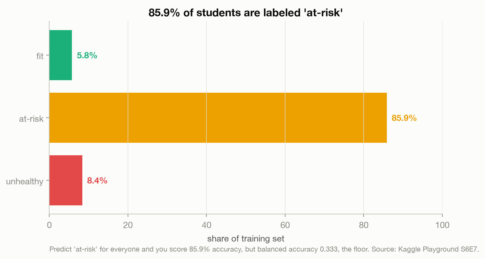
Nearly 86% of students are labeled at-risk. Only 8.4% are unhealthy and 5.8% are fit. So the “predict at-risk for everyone” model is right 85.9% of the time by doing nothing at all. In most conversations, 86% sounds like an achievement. Here it is the baseline you have to beat before you have done anything.
This is why the competition does not score on accuracy. It scores on balanced accuracy, which is the average of how well you find each class, with every class weighted the same no matter how rare it is. Get every at-risk student right and miss every fit and unhealthy one, and your balanced accuracy is 0.333, the no-skill floor, the same as guessing. The metric refuses to let the majority carry you.
The measuring stick, chosen by someone
If you read my last essay, this will feel familiar. That one was about how Moscow apartment prices looked stable through a currency collapse only because we were measuring them in the currency that was collapsing. The measuring stick was the whole story.
Here it is again, with one honest difference. In Moscow, nobody chose to measure wealth in rubles; it was just the default, the water everyone swam in. Here, someone did choose. Kaggle decided this competition would be scored on balanced accuracy rather than plain accuracy, and that single upstream decision is what makes the rest of this essay happen. It is the reason a “less accurate” model can win. I did not pick the stick, but somebody did, and that choice was a statement about what the model is supposed to care about.
That is the part worth sitting with. A metric looks like a neutral fact, a number on a leaderboard. It is actually a decision about whose errors count, and most of the time it is made quietly, in advance, by defaulting to accuracy because accuracy is what everyone reaches for.
Accuracy asks “how often are you right?” Balanced accuracy asks “are you right across every group, including the ones there are almost none of?” Those are different questions, and choosing between them is not a technical step. It is a values step wearing a technical costume.
One honest caveat about balanced accuracy itself, since I will spend the rest of the essay praising it. It treats all three classes as equally important, which means it rewards finding the fit students exactly as much as finding the unhealthy ones. That is a strange thing to want. Missing an unhealthy student sounds costly; missing a fit one costs nobody anything. Balanced accuracy is not “catch the people in danger.” It is the blunter “count every group the same regardless of its size.” That is still miles better than letting 86% of the data drown out the rest, but it is equity, not triage.
Two models, one difference
To show this is not just rhetoric, I trained two models on the identical data, with the identical algorithm (a gradient-boosted tree), the identical features, and the identical settings. The only thing I changed was one instruction: whether to weight the rare classes up so a mistake on a fit student stings as much as a mistake on an at-risk one.
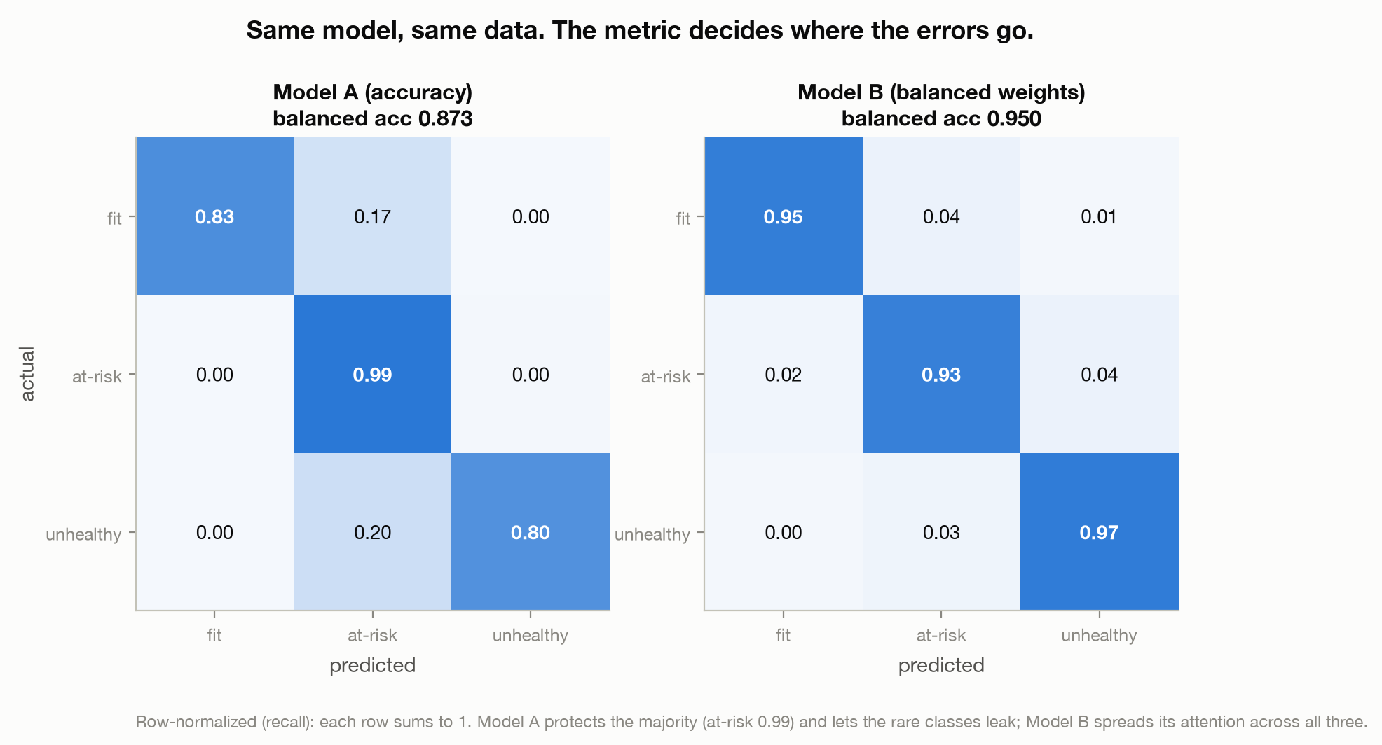
Read each row as “of the students who really were this class, where did the model put them?” That row fraction is the catch rate for the class, what the field calls recall. Model A, chasing plain accuracy, is a cautious specialist in the majority. It catches 99% of the at-risk students. On the rare classes it is careful rather than blind: it catches 83% of the fit and 80% of the unhealthy, and when it does flag one, it is almost always right. It has quietly decided that chasing the last fifth of the rare students is not worth the accuracy it would cost.
Model B, told every class counts the same, makes the opposite bet. It gives up a little on the majority (at-risk catch rate drops to 93%) and goes hunting for the tails: fit jumps to 95%, unhealthy to 97%. Nobody told it which features to use. All I changed was what I told it to care about, and it rearranged its entire behavior around that one instruction.
The leaderboard rewards the “worse” model
Here is the part I find genuinely clarifying. On plain accuracy, Model A wins: 96.7% versus 93.7%. By the metric most people reach for by default, Model A is the better model, full stop.
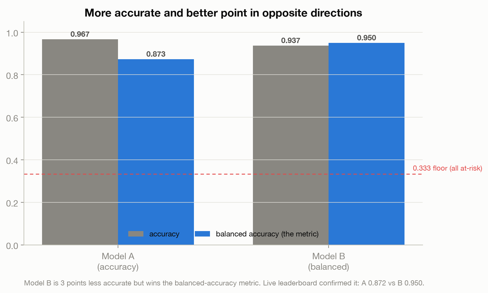
But this is a balanced-accuracy competition, so I submitted both to the live leaderboard. Model A scored 0.872. Model B, the “less accurate” one, scored 0.950. The board rewarded the model that was three points worse on accuracy, because it was the model that refused to write off the rare students. The leaderboard scores matched my local validation almost exactly (0.872 and 0.950), so this is a real effect, not a fluke of one split.
“More accurate” and “better” pointed in opposite directions, and the only thing that decided which one mattered was a choice made before a single model was trained.
What the two models see
There is a quiet bonus in Model B. Model A already catches most of the rare students, but it never has to learn them sharply, because on accuracy the last fifth is not worth chasing. Model B does have to chase them, and in chasing them it has to nail down what actually makes a fit student fit and an unhealthy one unhealthy.
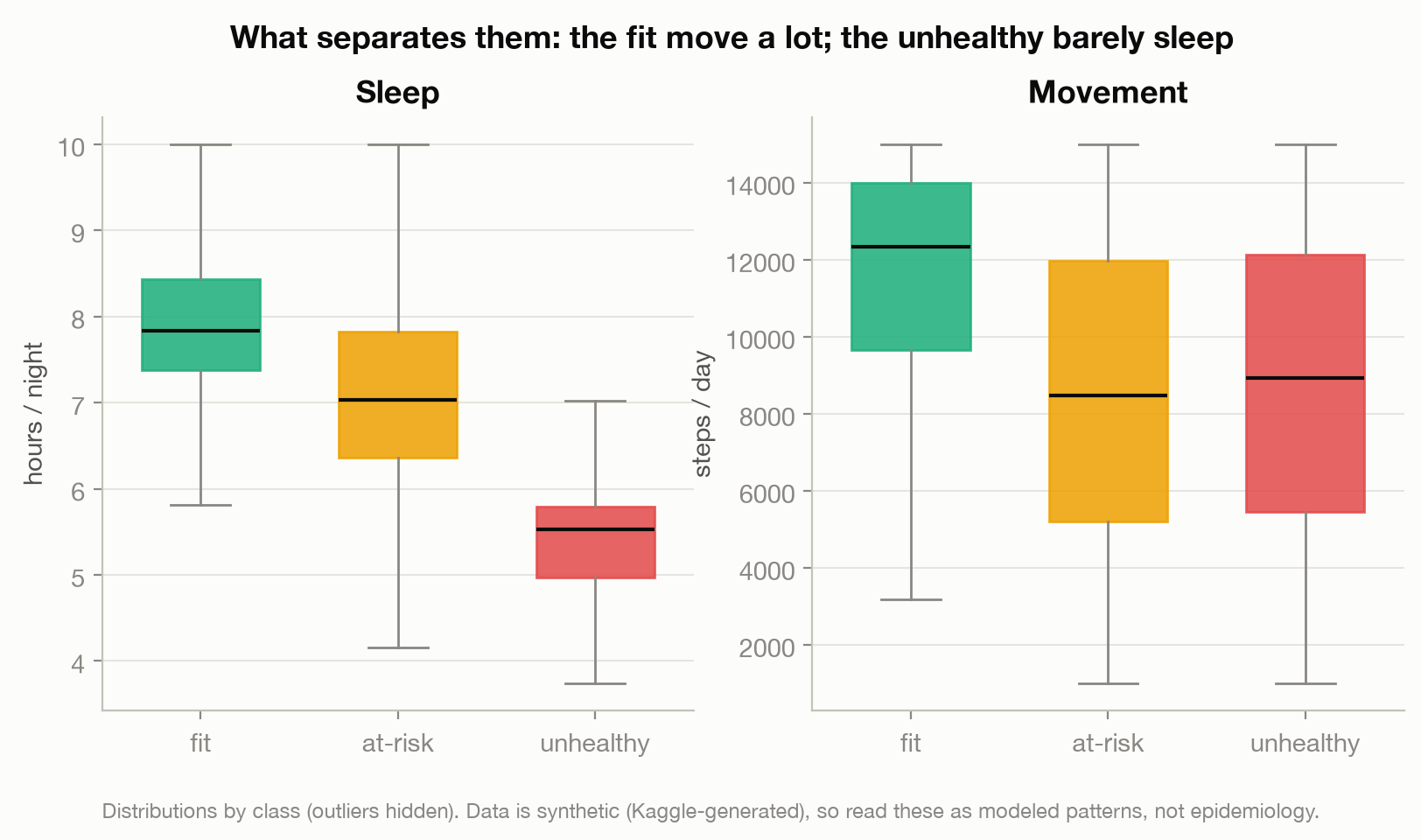
Two things do most of the separating, and they are not the same two things. The fit students are defined by movement: on average about 11,600 steps a day and 50 minutes of exercise, well clear of everyone else. The unhealthy students are defined by something quieter. They sleep around five and a half hours a night, against nearly eight for the fit.
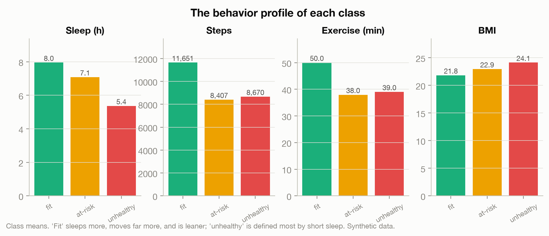
The detail I did not expect: the unhealthy students are not couch potatoes. They walk about 8,700 steps a day, essentially the same as the vast at-risk middle. You can hit your step goal and still land in the unhealthy group if you are sleeping five hours and carrying a higher BMI. Movement marks the fit; sleep marks the unhealthy.
I want to be careful about what that means, though. This data is synthetic, and the separations are almost suspiciously clean, which usually means the label was built from these very features in the first place. If so, Model B is not discovering something hidden about students; it is reverse-engineering the recipe Kaggle used to draw the labels. That is a fine thing to be good at for a competition, and a bad thing to mistake for a finding about real people.
The honest counterpoints
I think choosing balanced accuracy is a defensible default here, but I do not want to oversell it, and its biggest weakness is hiding in the same confusion matrices.
Model B catches more rare students by being far quicker to call someone fit or unhealthy, and that quickness has a price. Of the students Model B flags as unhealthy, about a third are not actually unhealthy. Of those it flags as fit, about a quarter are wrong. Model A is wrong on only about one in twenty of the same calls. So Model B wins the leaderboard while being, in a real sense, a crier of wolf. In an actual screening program, where 86% of people are the majority class, that flood of false flags is the real cost: worried students, wasted follow-ups, a health office that stops trusting the model. Balanced accuracy does not see any of that, because it only rewards catching true cases and never charges you for false alarms.
Which is the deeper point. Balanced accuracy assumes every class matters equally and every error costs the same. In the real world they do not. A missed unhealthy student and a false “you’re fit” are not the same mistake, and neither is a missed fit student. The genuinely right metric is a cost matrix nobody handed us: what does each kind of error actually cost? Balanced accuracy is a reasonable stand-in when you have not answered that question. It is not the answer.
What you agree to be judged by
The uncomfortable thing about metrics is that they look objective. A leaderboard is just a number, sorted. But every one of those numbers encodes a decision about whose errors matter, and that decision was made by a person, usually early, often by default, and almost always without much of an argument.
On this competition, that one decision is the difference between a model that ignores 14% of students and a model that does not. Someone chose the measuring stick before I ever trained a thing, and it quietly decided which of my two models was allowed to win. The least I can do is notice the stick is there, and ask who chose it, and why.
Method notes
Data: Kaggle Playground Series S6E7, “Predicting Student Health Risk” (Kaggle, 2026). 690,088 training rows, 295,753 test rows, target health_condition with three classes (at-risk 85.9%, unhealthy 8.4%, fit 5.8%). Thirteen features (seven numeric, six three-level categoricals), with real missingness (sleep 11%, stress 12%, and so on). Kaggle states the data is synthetically generated and inspired by a real College Student Health Behavior Dataset, with feature distributions close to but not exactly the original. Both models are scikit-learn HistGradientBoostingClassifier, which handles the missing values natively; categoricals are ordinal-encoded (Pedregosa et al., 2011). The two models are identical except for fit-time class weights (Model B uses balanced weights). Figures come from a single stratified 80/20 holdout: Model A accuracy 0.967, balanced accuracy 0.873, per-class recall 0.83 / 0.99 / 0.80 and precision 0.94 / 0.97 / 0.95 (fit / at-risk / unhealthy); Model B accuracy 0.937, balanced accuracy 0.950, recall 0.95 / 0.93 / 0.97 and precision 0.73 / 0.99 / 0.68. Both were submitted to the live competition (public leaderboard balanced accuracy 0.87241 for A, 0.94991 for B). Behavior figures are class means. Caveats: the data is synthetic, so behavioral patterns are illustrative and likely reflect the label-generation recipe rather than real students; balanced accuracy weights all classes equally and ignores error costs, which is a modeling choice, not a universal truth; results are one clean baseline, not a leaderboard-optimal solution. Code, both models, and the submissions are on GitHub: github.com/joechrisnaldy/data-stories.
References
Kaggle. (2026). Predicting student health risk (Playground Series S6E7) [Data set]. https://www.kaggle.com/competitions/playground-series-s6e7
Pedregosa, F., Varoquaux, G., Gramfort, A., Michel, V., Thirion, B., Grisel, O., Blondel, M., Prettenhofer, P., Weiss, R., Dubourg, V., Vanderplas, J., Passos, A., Cournapeau, D., Brucher, M., Perrot, M., & Duchesnay, E. (2011). Scikit-learn: Machine learning in Python. Journal of Machine Learning Research, 12, 2825-2830. https://jmlr.org/papers/v12/pedregosa11a.html
// About the author
Jonathan Chrisnaldy is a product manager and analyst in New York City, with an M.S. in Technology Management from Columbia University. He writes data stories about the numbers behind everyday claims. More on the experience page or LinkedIn.