· 10 min read · Jonathan Chrisnaldy
The Score You Didn't Build (and Shouldn't Trust)
A popular food dataset ships a 'health score' that literally adds grams of fat to milligrams of calcium. Reverse-engineering it took one line of code. Here is how to tell a number that was measured from a number someone made up, and why it matters for every score you did not build yourself.
Somewhere in a widely downloaded nutrition dataset, there is a column called “Nutrition Density.” It sits next to calories and protein and iron, in the same tidy format, and it promises something the other columns do not: a single number for how nutrient-rich a food is. One number to rank the whole pantry. It is the most useful-sounding column in the file, and it is the one you should throw away first. It turns out to be grams of fat added to milligrams of calcium added to micrograms of vitamin A, all poured into one pile and called nutrition.
I want to use it as a small worked example of a big habit, because the interesting thing is not this one dataset. It is how easily a number can wear a lab coat: sit in a spreadsheet, line up with real measurements, and pass for one. Some of those numbers were measured. Some are just formulas. Learning to tell them apart is most of what “reading data critically” actually means, and you can usually do it in an afternoon.
The recipe was hiding in plain sight
Here is the whole method, and it is almost embarrassingly simple. If you suspect a column is a formula built from the other columns, ask a regression to guess it from them. If it is really a measurement, the guess will be rough. If it is a formula, the regression will nail it, and the weights it comes back with are the recipe.
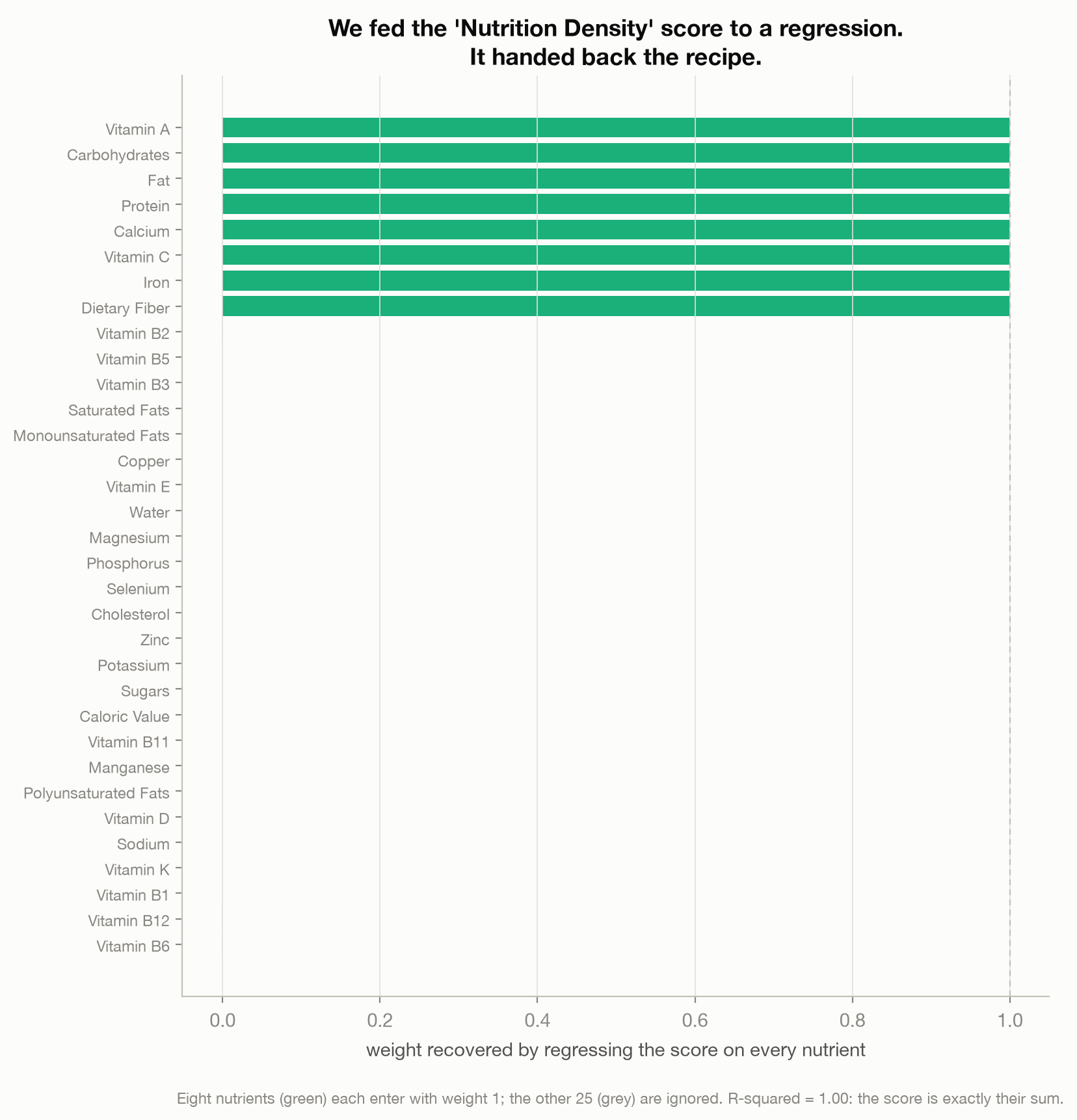
I fed “Nutrition Density” to a plain linear regression against the other 33 nutrient columns. It came back with an R-squared of 1.00, a perfect fit, which almost never happens with real data and is a dead giveaway that you are looking at arithmetic, not measurement. The recovered weights told the rest of the story: eight nutrients, each with a weight of exactly 1, and the other twenty-five ignored entirely. The famous “Nutrition Density” score is just this:
Fat plus Carbohydrates plus Protein plus Dietary Fiber plus Vitamin A plus Vitamin C plus Calcium plus Iron.
No expert weighting, no penalty for sugar or saturated fat, no reason offered for why those eight and not others. Just a sum.
Why the sum is nonsense
A sum can be fine. This one is not, because the eight things being added are measured in different units, and nobody converted them. Fat, carbohydrate, protein and fiber are in grams. Calcium, vitamin C and iron are in milligrams, a thousand times smaller. Vitamin A is in micrograms, a million times smaller. Adding them is like adding your height in centimeters to your weight in kilograms to your age in years and calling the total your “fitness.” Whichever quantity happens to carry the largest raw number wins, and that has nothing to do with importance.
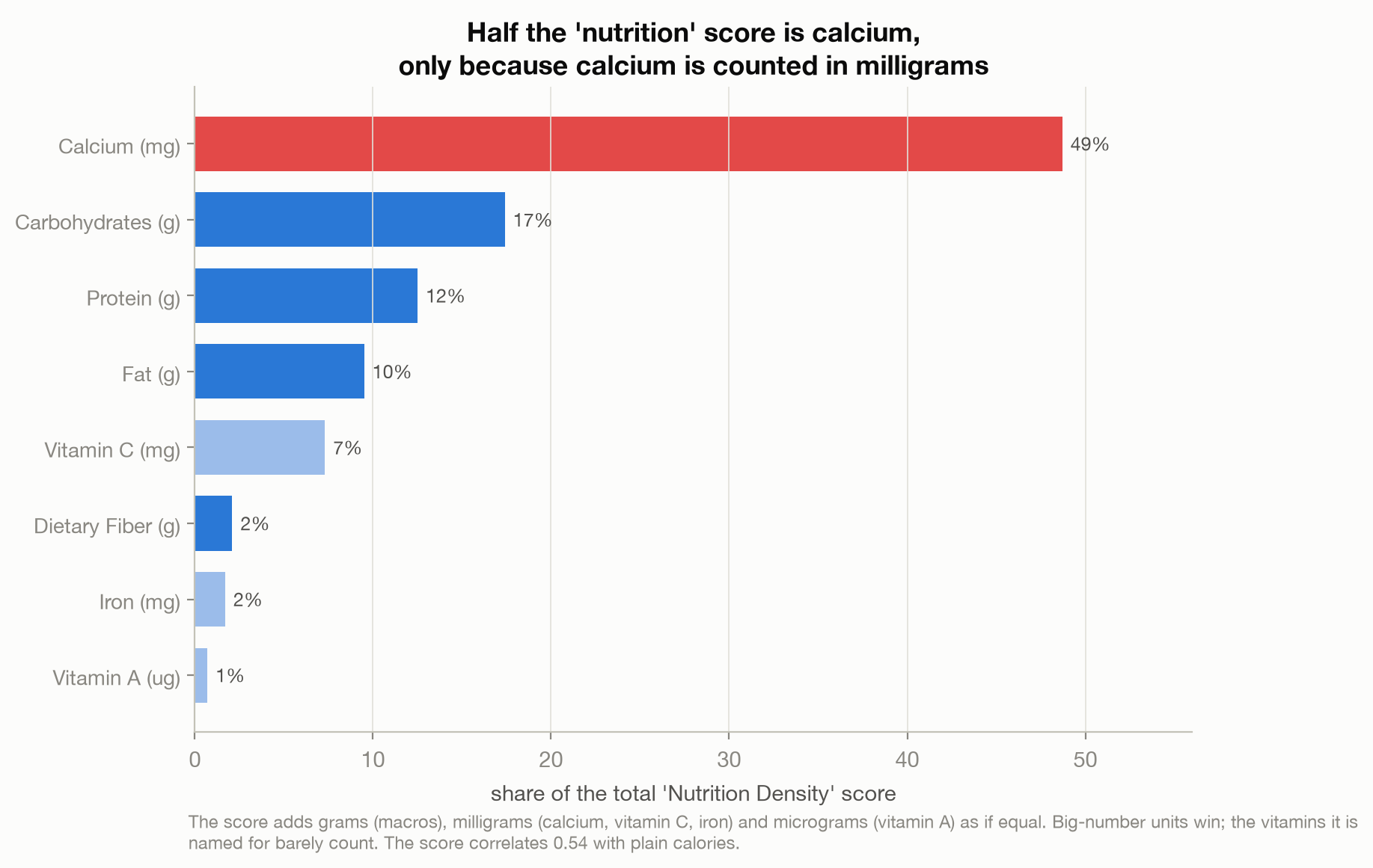
When you work out how much each ingredient actually contributes, the score is dominated by exactly the wrong things. Calcium alone is 49 percent of it, not because calcium matters more than everything else combined, but because calcium is counted in milligrams and the numbers are big. The three macronutrients add up to about 40 percent. The vitamins the score is named for barely register: vitamin A, in micrograms, contributes 0.7 percent. So a food scores as “nutrient-dense” mostly by being high in calcium or heavy in carbs, protein and fat, which is why the score correlates 0.54 with plain calories. A metric that is supposed to reward nutrition instead quietly rewards being caloric. It is not a health score. It is a unit accident.
A formula done right
Now the twist, because I do not want you to conclude that formulas are the problem. The calorie column in the very same dataset is also a formula, not a measurement, and it is a good one.
Nobody put each of these 2,395 foods in a lab and burned it to measure its energy. They used a rule from the 1900s. Every gram of carbohydrate counts as 4 calories, every gram of protein as 4, every gram of fat as 9. Those are the Atwater general factors, the international standard for turning macronutrients into calories (FAO, 2003).
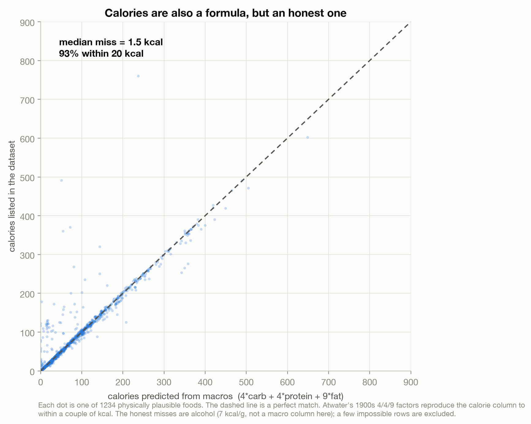
I applied that century-old rule to the macros and compared it to the calorie column. Across the roughly 1,234 foods whose numbers are physically plausible, the two agree to within 1.5 calories for a typical food, and 93 percent land within 20 calories of each other. The calorie count on a nutrition label was, in all likelihood, never measured for that specific food either. It is arithmetic. But it is arithmetic done right: the weights are published, they mean something physical, and they have been checked against reality for a century. The honest misses inside that set are revealing rather than embarrassing, mostly alcoholic drinks, because alcohol carries about 7 calories a gram (FAO, 2003) and there is no alcohol column here for the formula to use. (I had set aside a separate batch of rows with physically impossible values before running the comparison, a reminder that this is an unofficial convenience dataset, not a reference.)
So a formula is not a red flag. A hidden, arbitrary formula is. The calorie column and the “Nutrition Density” column look identical in the spreadsheet. One is a disclosed, validated rule. The other is a pile of mismatched units. Nothing on the surface tells you which is which. You have to check.
What a good bundled score looks like
If you want proof that you can bundle many nutrients into one number responsibly, it already exists. Nutri-Score, the front-of-pack label used across much of Europe, does exactly that. It scores foods on negative components (energy, saturated fat, sugars, sodium) against positive ones (fibre, protein, and fruit, vegetables and nuts), using a published point system with disclosed weights (Rayner et al., 2009); the Nutri-Score adaptation later widened that positive list to include legumes (Deschasaux et al., 2018). You may disagree with its choices, but they are choices, written down, made for a stated purpose, and open to argument.
And crucially, someone checked whether it tracks reality. When researchers followed nearly half a million adults across Europe, people whose overall diets scored worse on the system behind Nutri-Score had a higher risk of cancer (Deschasaux et al., 2018). That is an observational link, not proof that the label itself changes outcomes, but it is the kind of test the “Nutrition Density” sum never faced and could never pass. The difference between the two scores is not that one bundles and the other does not. Both bundle. The difference is that one discloses its weights, chose them for a reason, and validated them, and the other added grams to milligrams and hoped.
Any score you didn’t build
This is why the little “Nutrition Density” column is worth your attention, even though almost nobody will ever use that exact dataset. The same shape is everywhere. Your sleep app gives you a “sleep score.” Your watch gives you a “readiness” number. Your food app gives dishes a health grade, your bank gives you a credit score, your favorite site ranks phones and cities and colleges by a single index. Every one of those is a “Nutrition Density” in disguise: a bundle of many things, collapsed into one number, weighted by choices somebody made and usually did not show you.
Some of them are Nutri-Scores, thoughtful and tested. Some are unit accidents dressed up as insight. You cannot tell from the number, and you cannot tell from how confident the app looks. So before you trust a score you did not build, ask it three questions. What goes into it? How are the pieces weighted? And did anyone ever check it against reality? If the answer to any of them is a shrug, you are looking at someone’s opinion wearing a lab coat. And often, as with this one, you can pull the coat off in an afternoon with a single line of code.
This is an analysis of a public dataset and public research, not medical or financial advice.
Method notes
Data: Kaggle “Food Nutrition Dataset” (Dey, 2024), five group files, 2,395 foods combined, with per-100g nutrient columns and the uploader’s own “Nutrition Density” column. It is an unofficial, popular convenience dataset with no stated provenance, and it is not reliably per-100g: about 48 percent of rows have fat, carbohydrate, protein and water summing to more than 105 grams per 100 grams, which is physically impossible. Because of that I use only the parts that survive bad rows: the exact formula behind the derived columns, and broad relationships. I do not rank foods or quote absolute amounts. The formula was recovered by regressing “Nutrition Density” on the 33 numeric nutrient columns (R-squared 1.00; it equals the sum of the eight nutrients with recovered weights of 1.0). Contribution shares are each ingredient’s mean value as a percentage of the summed mean. The calorie check compares each food’s listed calories to 4carbohydrate + 4protein + 9*fat on the physically plausible rows (calories between 1 and 900 and the mass constraint satisfied, 1,234 foods); the median absolute difference is 1.5 calories. All within-data results are descriptive. The Atwater factors and the Nutri-Score facts are external and cited below. Code is on GitHub: github.com/joechrisnaldy/data-stories.
References
Deschasaux, M., Huybrechts, I., Murphy, N., Julia, C., Hercberg, S., Srour, B., Vidal, L., Kaaks, R., … Touvier, M. (2018). Nutritional quality of food as represented by the FSAm-NPS nutrient profiling system underlying the Nutri-Score label and cancer risk in Europe: Results from the EPIC prospective cohort study. PLOS Medicine, 15(9), e1002651. https://doi.org/10.1371/journal.pmed.1002651
Dey, U. (2024). Food nutrition dataset [Data set]. Kaggle. https://www.kaggle.com/datasets/utsavdey1410/food-nutrition-dataset
FAO. (2003). Food energy: Methods of analysis and conversion factors (FAO Food and Nutrition Paper 77). Food and Agriculture Organization of the United Nations. https://www.fao.org/4/y5022e/y5022e00.htm
Rayner, M., Scarborough, P., & Lobstein, T. (2009). The UK Ofcom nutrient profiling model: Defining ‘healthy’ and ‘unhealthy’ foods and drinks for TV advertising to children. British Heart Foundation Health Promotion Research Group, University of Oxford. https://www.ndph.ox.ac.uk/food-ncd/files/about/uk-ofcom-nutrient-profile-model.pdf
// About the author
Jonathan Chrisnaldy is a product manager and analyst in New York City, with an M.S. in Technology Management from Columbia University. He writes data stories about the numbers behind everyday claims. More on the experience page or LinkedIn.